

Colourful kitchen cabinets can bring personality to a room dominated by hard, practical surfaces, but cabinetry is a much bigger colour commitment than a painted wall or a few accessories. A green that looks restrained on a sample card may feel much stronger across a full bank of tall units, while a beautiful burgundy can become heavy when combined with dark flooring, black appliances and limited daylight.
The better approach is to choose colour in relation to the kitchen that already exists. Countertops, backsplash, flooring, cabinet quantity, natural light and adjoining rooms should influence where the strongest colour goes and how much of it you use. Benjamin Moore likewise recommends taking colour cues from existing kitchen features and considering countertop undertones when selecting cabinet shades.
These colourful kitchen cabinet ideas cover both the colours themselves and the decisions that make them work: where to use them, what to pair them with, when to reduce their visual weight and what to test before repainting or ordering a new kitchen.
1. Start With the Countertop, Floor and Backsplash
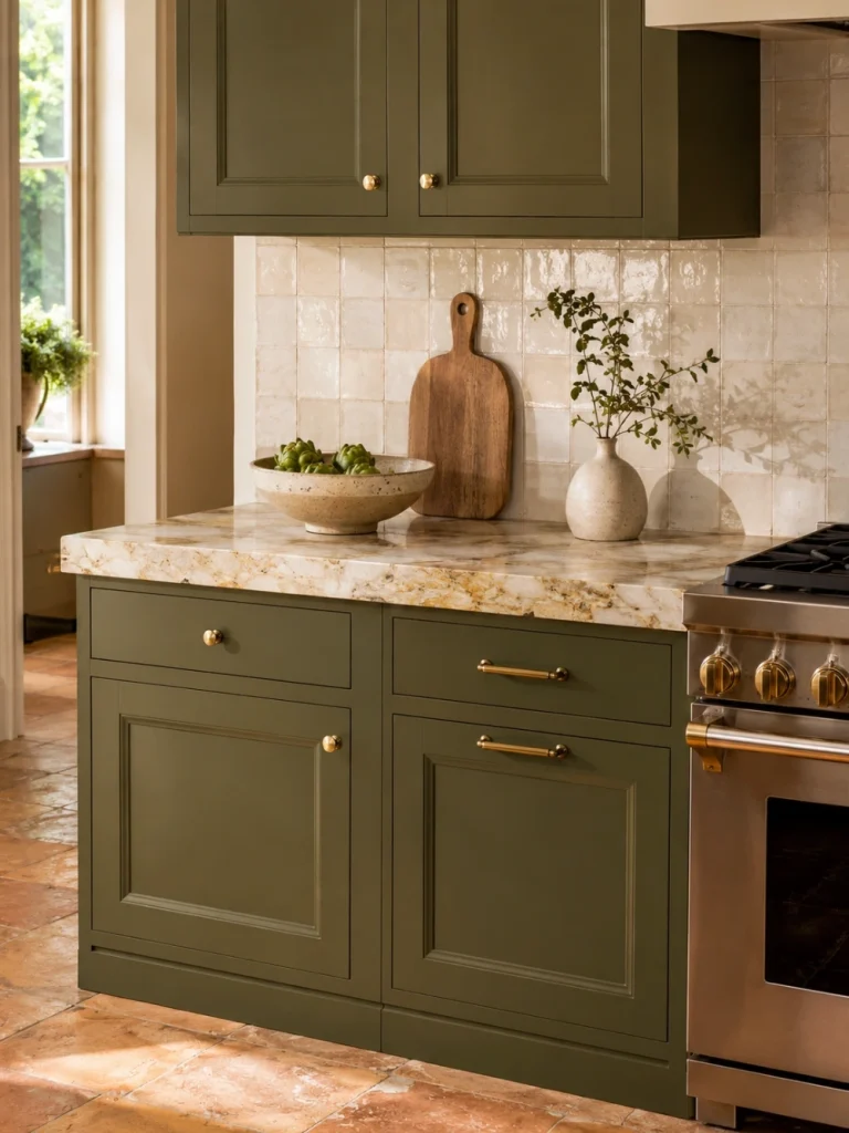
Do not choose the cabinet colour in isolation.
Cabinetry occupies a large portion of the kitchen, but countertops, stone, flooring and tile may be more difficult or expensive to replace. Treat those surfaces as the starting conditions.
Look closely at their undertones.
A warm cream stone with brown or gold movement may sit comfortably beside olive, burgundy, terracotta or a dirty yellow. A cool white countertop with blue-grey veining may respond better to dusty blue, blue-green or a cooler plum.
This does not mean every surface needs the same undertone. It means their relationship should appear deliberate.
Benjamin Moore specifically recommends looking to countertops, backsplash, fixtures and flooring for colour cues and notes that compatible countertop and cabinet undertones can create a more cohesive scheme.
Place your colour sample vertically against a cabinet door and directly beside the countertop and backsplash. Then place another sample near the floor.
If the colour only works when you hold the card in the middle of the room, it has not passed the Fixed-Surface Test.
2. Test Colour at the Scale of the Cabinets
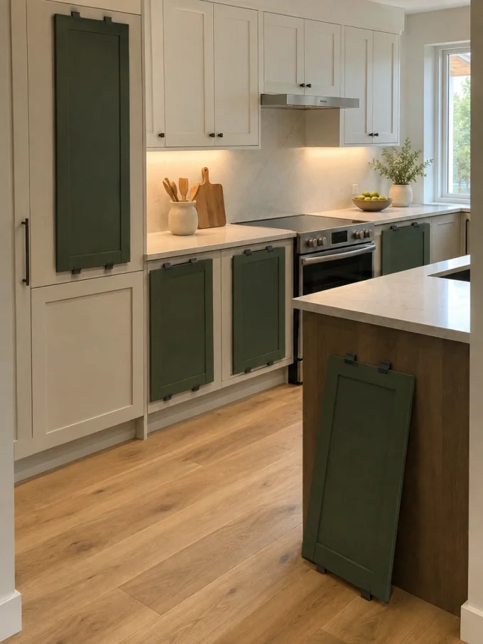
A tiny paint swatch does not represent a kitchen.
Before ordering twenty painted doors—or spending days refinishing the existing ones—make the colour physically larger.
Paint a large removable board, sample door or several connected pieces of card. Position them across different parts of the cabinet run.
Check the sample:
- in morning daylight;
- at the darkest part of the day;
- beneath under-cabinet lighting;
- beside the countertop;
- next to stainless, black or integrated appliances;
- and from the doorway or adjoining living area.
This is the Cabinet-Mass Test. You are judging not only whether you like the hue, but whether you like that amount of it.
A dark green island may feel rich. The identical green on an island, all the lower cabinets, every upper cabinet and a wall of pantry units can behave like an entirely different design.
3. Use Olive or Moss Green as a Grounded Full-Kitchen Colour
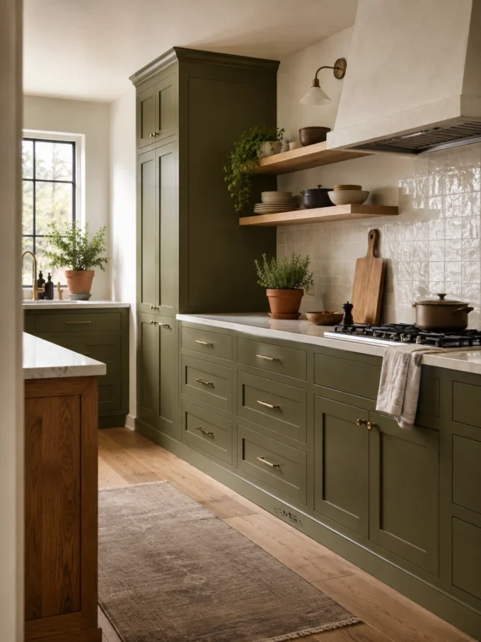
Green remains one of the easiest ways to move beyond neutral cabinetry without making the kitchen feel disconnected from natural materials.
Current 2026 kitchen reporting continues to feature green and other earthy colours as part of a broader shift toward more characterful cabinetry.
For a full cabinet run, look beyond vivid emerald and compare olives, mosses and muted greens with brown, grey or yellow in the undertone.
They tend to sit convincingly beside:
- oak;
- walnut;
- cream stone;
- warm white walls;
- aged brass;
- terracotta;
- and soft black.
The limitation is visual density. Deep green cabinetry combined with a dark floor, dark stone and weak daylight can make the lower half of the kitchen extremely heavy.
In that situation, keep upper cabinetry lighter, introduce timber or use a paler worktop to give the eye a break.
Readers exploring broader earthy 2026 palettes can also compare the richer greens, browns and rust tones in DecoralCove’s autumn home decor trends. The current article similarly emphasises using only the shades that genuinely solve a room problem rather than stacking every fashionable colour together.
4. Try Dusty Blue When Bright Blue Feels Too Sharp
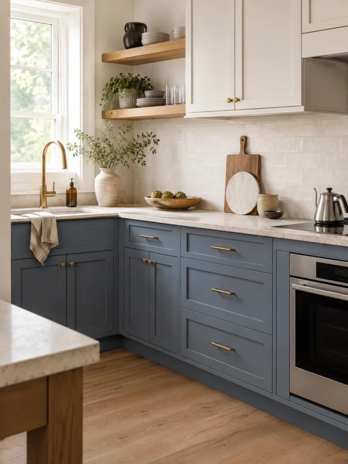
Blue cabinetry does not need to look nautical or intensely saturated.
A dusty medium blue, muted slate or greyed denim can introduce visible colour while remaining quieter than cobalt or royal blue.
House Beautiful’s current 2026 colour coverage includes both mint and deep navy cabinetry, illustrating how widely blue-green colour can range in kitchens.
For a compact kitchen, try blue on the lower cabinets and leave the upper portion lighter if a full dark wall feels too dense.
For a larger kitchen, the same colour can stretch across taller cabinets if the floor and countertop provide enough contrast.
DecoralCove’s cool blue paint ideas includes a dedicated dusty-blue kitchen cabinet example and similarly distinguishes medium blue lower cabinets from deeper blue in rooms with stronger daylight.
Before you commit: compare the sample under your actual kitchen bulbs. A muted blue that looks calm in daylight can become noticeably greyer under warmer artificial light.
5. Use Butter Yellow Where the Kitchen Needs Warmth
Yellow cabinetry can be cheerful without becoming lemon-bright.
Current 2026 designer reporting includes a renewed interest in warm, medium buttery yellows, particularly shades containing enough brown or green to keep them from feeling fluorescent.
Yellow becomes especially useful in a kitchen that contains:
- dark timber;
- brown flooring;
- muted stone;
- limited northern light;
- or several visually cool metal finishes.
It can introduce warmth without requiring a white or beige cabinet scheme.
The biggest risk is saturation.
A highly chromatic yellow over an entire wall of cabinets can dominate the stone, stools, artwork and nearby dining furniture. If the shade feels too loud at full scale, move it to the island, pantry or lower cabinetry instead.
Dustier yellow and ochre also appear within DecoralCove’s current autumn home decor trends, where muted yellow is used to interrupt darker palettes rather than adding another heavy layer.
6. Give Burgundy or Oxblood Room to Look Grown-Up
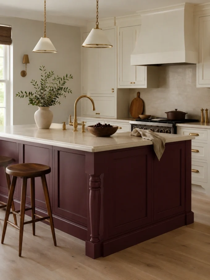
Red kitchen cabinets do not have to mean glossy scarlet.
Burgundy, wine, brick red and oxblood have enough brown or blue in them to feel deeper and less primary. Current design reporting is also leaning toward aged, moodier kitchen colours rather than relying entirely on clean neutrals.
These shades can work particularly well with:
- walnut;
- cream;
- aged brass;
- soft pink;
- pale stone;
- muted blue;
- and warm white.
Give the red room to breathe.
A burgundy cabinet wall next to dramatic veined stone, patterned tile, dark flooring and highly decorative hardware can become visually overloaded. If the cabinetry is the main colour event, let one or two of the surrounding finishes become quieter.
For a smaller commitment, paint only the island or a freestanding-style cabinet.
7. Try Plum or Aubergine Instead of Another Navy Kitchen
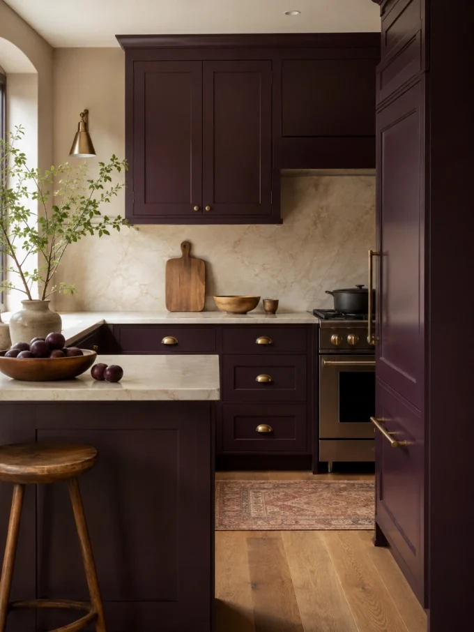
Purple is still unusual enough on cabinetry to feel personal, but it does not need to be bright violet.
Look at plum, aubergine, berry-brown and smoky purple-grey.
Elle Decor’s 2026 kitchen-colour reporting specifically notes stronger interest in rich purples among deeper, moodier kitchen palettes.
Aubergine can behave almost like a warm dark neutral when paired with cream stone and wood. Mauve-grey can create a softer interpretation.
DecoralCove’s purple paint color ideas already demonstrates plum as a controlled kitchen accent and recommends keeping surrounding surfaces simpler when purple becomes the focal colour.
Avoid if: the kitchen already contains several cool grey finishes. Some purples can make the entire room feel colder when the flooring, stone and light are also blue-based.
Test them together rather than judging the cabinet colour alone.
8. Use Muted Pink Without Making the Kitchen Sugary
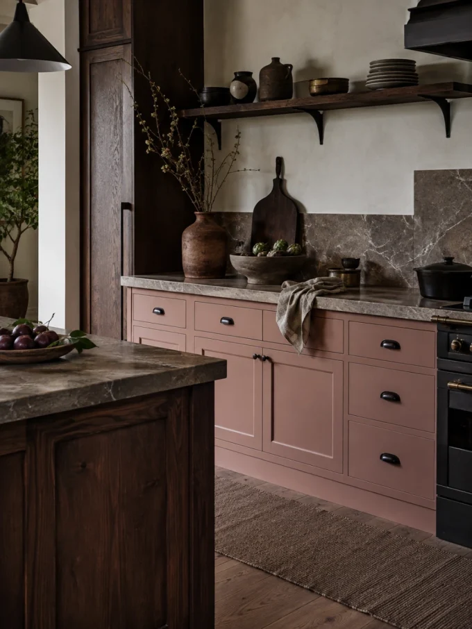
Pink cabinetry can work beyond children’s spaces and highly themed interiors.
The more versatile direction is often a dirty blush, clay pink, brown-pink or salmon rather than a candy pastel.
Current 2026 reporting from Elle Decor identifies these less-perfect, muddied pastels as part of the movement away from sterile kitchen colour.
The surrounding material can change how pink reads.
Pair blush cabinetry with polished brass and white marble and it may feel delicate. Put the same family beside dark timber, brown stone or blackened metal and it becomes earthier.
Instead of asking whether pink is “too feminine,” ask whether its undertone has a convincing relationship with the kitchen materials.
That produces a more useful answer.
9. Let Teal Become One Controlled Focal Point
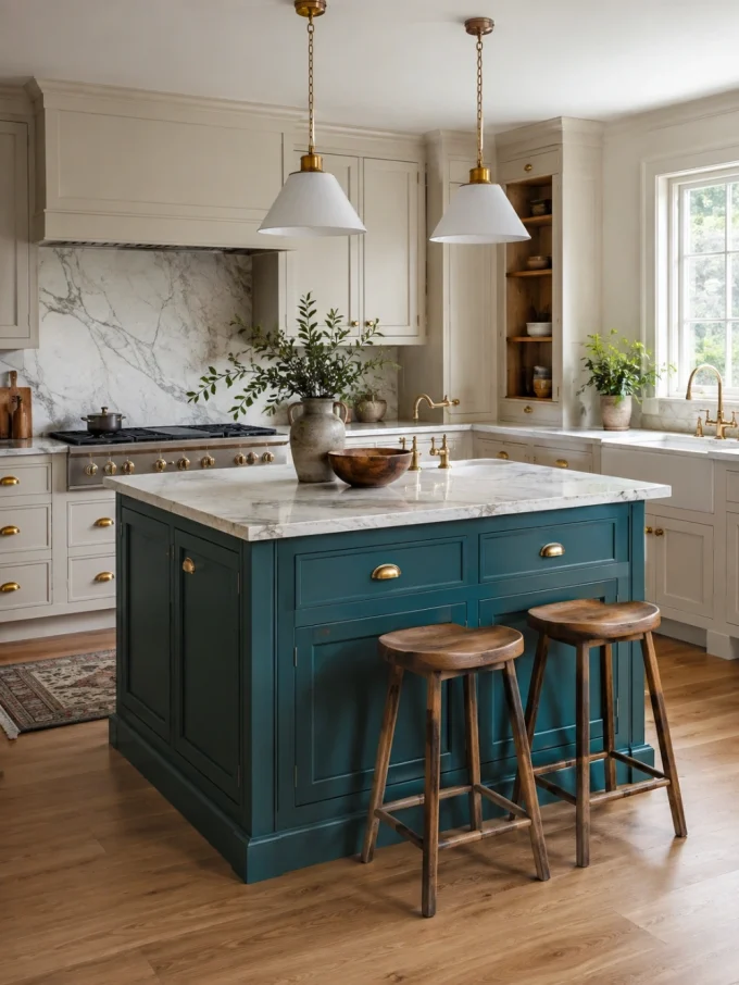
Teal sits between blue and green, which makes it useful when the room already contains both warm and cool materials.
It can connect cool veining in stone with warm timber, for example, without matching either literally.
But teal is visually assertive.
If the backsplash is already heavily patterned or the countertop contains dramatic colour, use teal on one contained cabinet zone rather than every surface.
Good candidates include:
- the island;
- lower cabinets;
- a pantry wall;
- one freestanding dresser-style cabinet;
- or a breakfast-area cabinet.
A controlled focal zone gives the colour somewhere to stop.
10. Put the Stronger Colour on Lower Cabinets
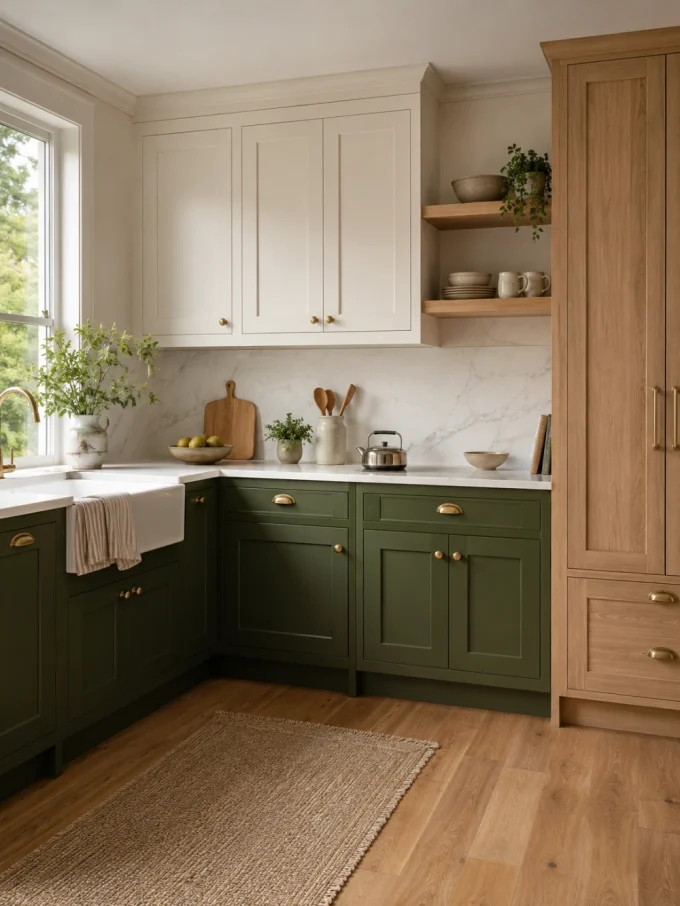
A two-tone kitchen does not need two colours distributed equally.
Using a deeper colour below and a lighter colour above can ground the lower part of the kitchen while reducing the apparent mass of the wall cabinetry. Current expert advice on two-colour kitchens likewise recommends thinking carefully about tonal versus contrasting combinations and notes the usefulness of darker cabinetry below with lighter areas above.
Try combinations such as:
- olive lowers + warm cream uppers;
- dusty blue lowers + pale grey-blue uppers;
- burgundy lowers + soft pink-beige uppers;
- teal lowers + muted white uppers;
- deep plum lowers + timber shelving above.
Do not automatically divide the kitchen at the worktop line, though.
If one wall contains full-height pantry cabinetry, forcing it into the lower colour can produce a huge dark block. Sometimes the tall units should take the lighter colour or natural wood instead.
11. Make the Island the Colour Experiment
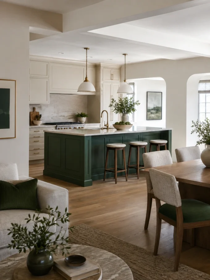
An island is one of the safest places to use a stronger cabinet colour because it already behaves as a separate object in the room.
A saturated green, yellow, brick red, blue or plum island can therefore feel deliberate rather than random.
The island also gives you an opportunity to compare colour from several directions. In an open-plan kitchen, it may be visible from the sofa, dining table and entrance rather than only from the cooking zone.
That wider view matters.
DecoralCove’s open kitchen design ideas recommends repeating a limited number of colours and materials across connected kitchen and living spaces instead of making the zones identical.
If the island becomes dark green, for example, you might repeat that family once through dining upholstery, artwork or a small decorative object in the adjoining room—not on every available surface.
12. Give the Pantry or Coffee Zone Its Own Cabinet Colour
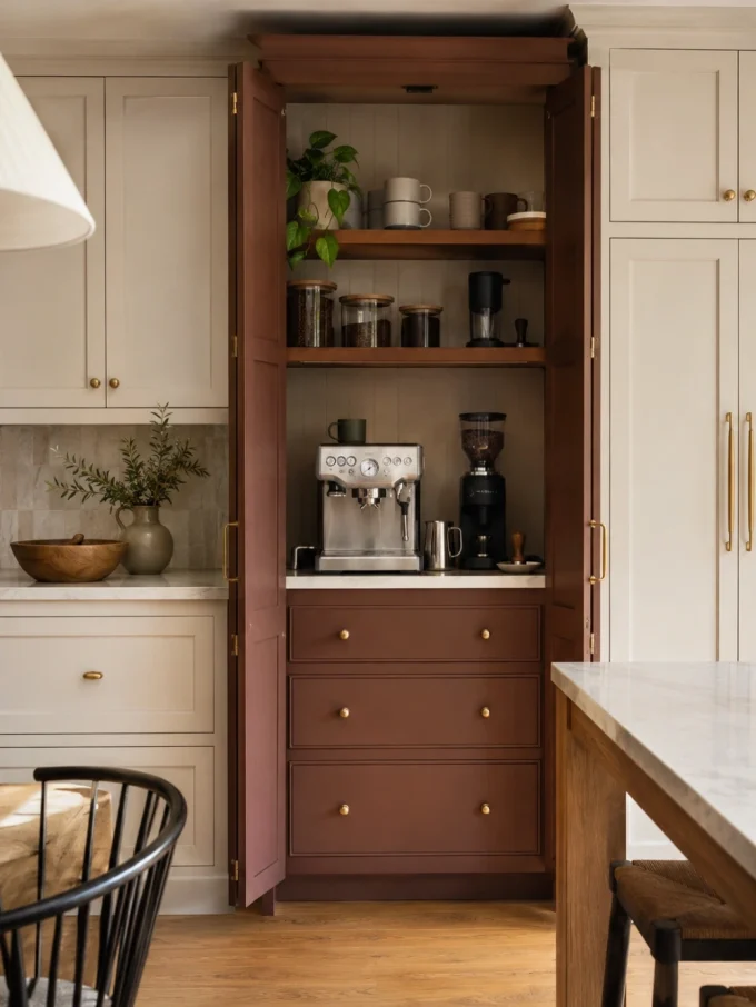
Not every colourful kitchen needs the main cabinetry painted.
A pantry, appliance garage or coffee station can become a smaller colour pocket.
This is particularly useful for readers who love bold colour but hesitate to make it the permanent background to the entire room. Elle Decor’s 2026 reporting also identifies pantries and other contained spaces as places where homeowners are experimenting more confidently with stronger hues.
Try a grassy green pantry inside a cream kitchen, a red-brown coffee cabinet beside oak, or a blue-grey appliance cupboard surrounded by warm white units.
The colour then signals a functional zone as well as adding personality.
If that zone needs better organisation before it needs paint, DecoralCove’s coffee station ideas covers cabinet-based, concealed and compact coffee setups.
13. Layer Two Shades From the Same Colour Family
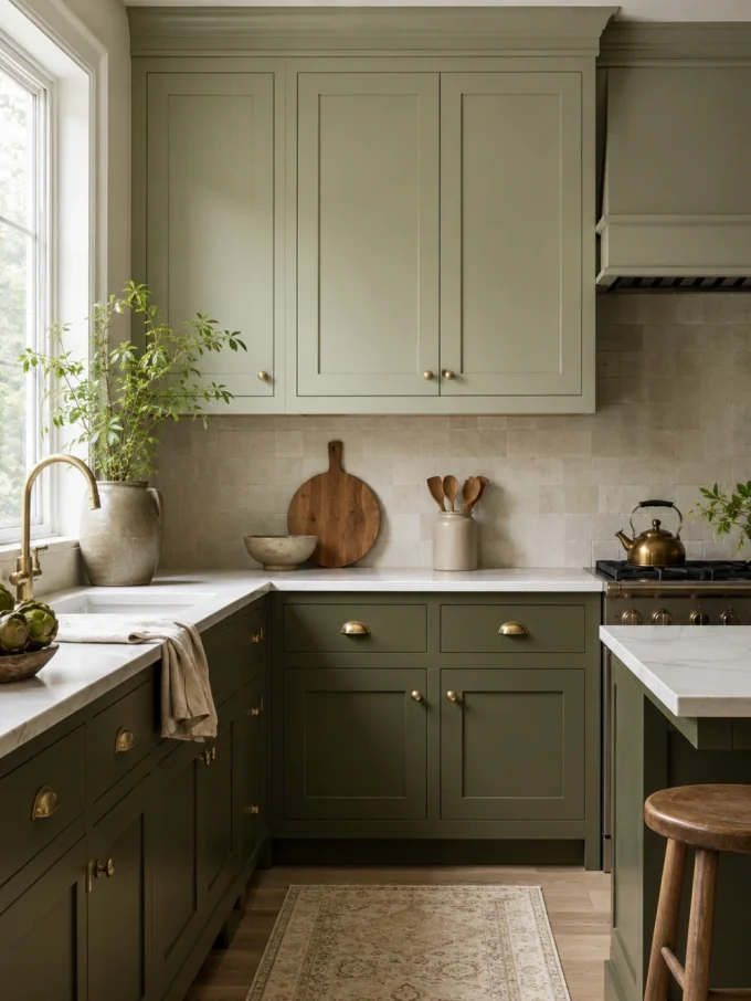
Two-tone does not have to mean strong contrast.
A pale sage upper cabinet with deeper olive lowers can feel quieter than green plus white. Powder blue paired with slate blue can do the same.
House Beautiful’s current kitchen-colour guide includes an example of cabinetry and an island painted in different shades of blue, demonstrating how tonal variation can create depth without changing colour families.
Tonal schemes work because the relationship is already established.
You can vary:
- lightness;
- saturation;
- warmth;
- or finish.
Do not choose two almost-identical shades by accident. If the difference is too slight, one may simply look like a mismatched paint batch.
Set the samples directly beside each other before approving them.
14. Mix Colourful Cabinets With Natural Timber
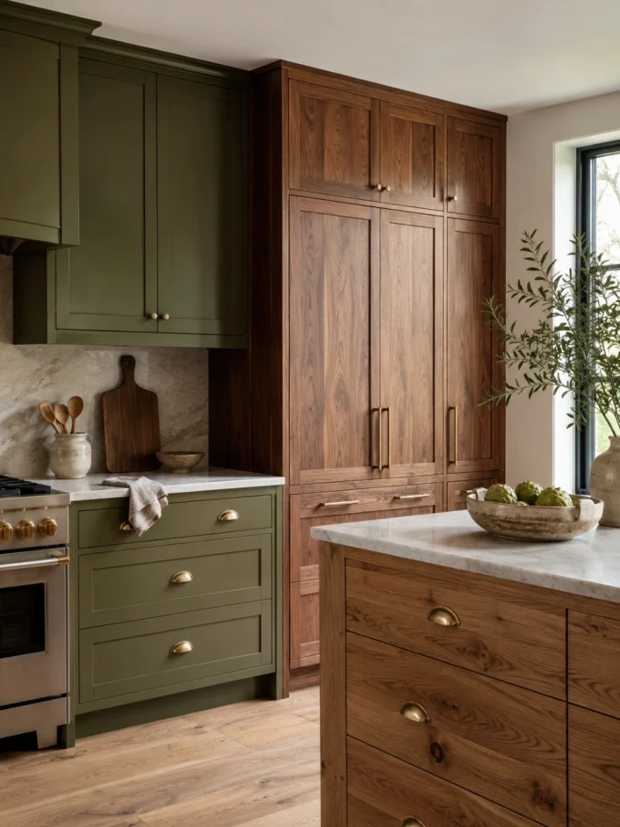
Paint does not have to cover every door.
Natural timber can act as a visual pause between stronger colour blocks.
Imagine an olive kitchen with a walnut pantry wall, dusty-blue base cabinets with oak uppers, or plum cabinetry surrounding a timber island.
Current 2026 kitchen reporting continues to highlight both expressive colour and darker natural wood, making the two directions complementary rather than mutually exclusive.
The grain also adds information without introducing another hue.
Be careful, however, with wood-effect materials. Real timber, veneer and printed wood-look cabinet fronts do not age, repair or respond to moisture identically. Choose the system based on its actual construction, not simply the photographed appearance.
15. Use Three Cabinet Colours Only When One Is Clearly in Charge
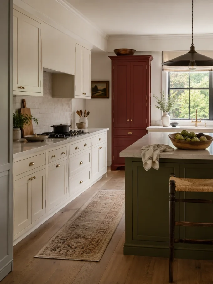
A three-colour kitchen can look collected rather than chaotic, but each colour needs a role.
Give one colour the largest share, another a supporting zone and the third a limited accent.
For example:
Warm cream: main cabinet run
Olive: island
Muted red: pantry cabinet
Or:
Dusty blue: lowers
Pale blue-grey: uppers
Natural oak: tall storage
Current colour guidance describes three-colour schemes as workable when one hue remains dominant and the others take secondary and accent roles.
Do not apply a formula mechanically, though.
A kitchen with one enormous pantry wall does not distribute colour like an empty room. Judge actual cabinet area and sight lines rather than percentages on paper.
16. Let Stone, Tile and Hardware Bridge the Colours
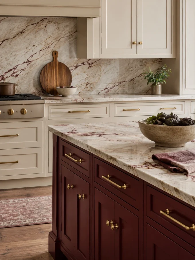
When two cabinet colours seem slightly disconnected, a shared surface can link them.
A stone containing both warm cream and burgundy veining might sit between cream perimeter cabinetry and a wine-red island. A backsplash containing green and pale blue can connect those two cabinet tones. A consistent metal finish can provide repetition across separate coloured zones.
That does not mean the countertop needs to match the doors.
The goal is a relationship, not duplication.
Also remember that hardware creates dozens of repeated marks across cabinetry. Changing from black to warm brass or brushed nickel can alter how a cabinet colour reads because the contrast changes at every handle.
Choose cabinet colour, stone and hardware as one group rather than approving each independently.
17. Coordinate Colourful Cabinets With the Room Beyond the Kitchen
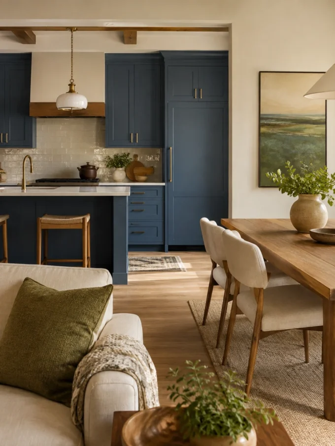
Open-plan kitchens have no visual door to close.
A bright blue kitchen may therefore become part of the living room palette, while a dark burgundy island may be visible from the dining area all day.
Before selecting the cabinet colour, stand in the adjoining room.
What will you see?
DecoralCove’s open kitchen design ideas recommends repeating a limited set of colours, finishes and materials across connected spaces while allowing each zone to maintain its own function.
That principle is especially useful with colourful cabinetry.
Repeat the cabinet colour once or twice through an object with a different material or intensity rather than ordering matching furniture.
A green kitchen might relate to a muted green artwork. A blue island may connect with dining upholstery. A burgundy pantry might pick up a small red thread in a rug.
The home feels connected without becoming colour-coded.
A nearby eating zone can also provide the gentler repetition; DecoralCove’s best breakfast nook ideas includes examples of keeping contemporary dining areas controlled while bringing colour through artwork and softer materials.
18. Treat Cabinet Repainting as a Finishing Project, Not Wall Painting
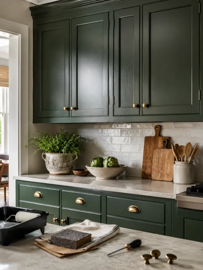
Painting existing cabinets can be a practical way to introduce colour without replacing the entire kitchen, but cabinet doors are high-touch surfaces exposed to grease, cleaning, repeated opening and abrasion.
Preparation therefore matters.
Identify the cabinet substrate and existing finish first. Clean thoroughly, follow the chosen primer and coating system, allow the specified drying time between coats and respect the manufacturer’s cure guidance.
Benjamin Moore’s current cabinet-painting instructions include preparation, primer, sanding and repeat paint stages. The company also warns that although cabinets may return to service after drying, full hardness and adhesion continue developing and newly painted surfaces should not be subjected immediately to heavy abrasion or cleaning.
Its cabinet guidance identifies satin, semi-gloss and high-gloss finishes as suitable cabinet options and emphasises using coatings intended to withstand cabinet use.
Do not assume every factory finish, laminate door or previously coated cabinet can accept the same preparation system.
When the substrate or old coating is uncertain, check the paint manufacturer’s technical instructions or get professional advice before covering the entire kitchen.
Renters should be particularly cautious. Permanent cabinet painting may breach a tenancy agreement, and adhesive coverings are not automatically harmless on every finish. DecoralCove’s rental apartment decorating ideas offers lower-commitment alternatives for kitchens where permanent changes are unsuitable.
Final Thoughts
The best colourful kitchen cabinets are not necessarily the brightest ones.
Start with the surfaces you are keeping. Test the proposed colour across enough area to understand its real visual weight. Then decide whether the kitchen needs full-colour cabinetry, a darker lower half, a statement island, a coloured pantry or simply one painted furniture-style element.
Most colour mistakes happen when the cabinet door is chosen as an isolated object. The successful schemes consider the entire view: stone, floor, backsplash, appliances, lighting, timber, hardware and the rooms visible beyond the kitchen.
If several strong decorative decisions are already competing, DecoralCove’s home decor mistakes to avoid can help identify what should be edited before another colour is added.
Frequently Asked Questions
What colourful kitchen cabinet colours are popular in 2026?
Current 2026 design coverage is favouring a broad range rather than one dominant colour, including earthy greens, warm yellows, rich purples, burgundy and other deeper tones, muddied pastels and unexpected colour accents.
The more useful question is which of those colours works with the fixed materials and light in your own kitchen.
What cabinet colours make a small kitchen feel less heavy?
Lighter or muted cabinet colours can reduce visual weight, but a small kitchen does not automatically require white cabinets. Another useful strategy is keeping upper cabinets lighter while using a richer colour below, particularly when the room already contains several dark finishes. Current expert guidance similarly cautions against allowing too many strong colours to crowd a compact kitchen.
Can you use two different colours for kitchen cabinets?
Yes. Two-tone cabinetry can divide colour by lower and upper cabinets, island and perimeter, pantry and main run, or two tonal shades from the same family. The strongest schemes give each colour a clear architectural zone rather than alternating colours randomly.
Should the kitchen island be a different colour from the cabinets?
It can be, especially when you want strong colour without applying it to every cabinet. An island already behaves as a separate piece of the layout, so a different finish can reinforce its role as a focal or gathering point. Check how it looks from adjoining rooms before committing in an open-plan home.
What should I check before painting existing kitchen cabinets?
Identify the cabinet material and existing coating, clean and prepare the surfaces correctly, use compatible primer and cabinet-suitable paint, follow drying and recoating instructions, and allow the coating sufficient time to harden before heavy cleaning or abrasion. Manufacturer requirements vary, so the instructions for the actual product and substrate should take priority.