
The right cool blue paint ideas can make a room feel calm, fresh, and visually open. The wrong blue, however, may look cold, gray, green, or unexpectedly purple once it meets the room’s flooring, furniture, and natural light.
That is why choosing blue from a small color card is rarely enough.
A pale icy blue may brighten a compact bedroom, while dusty blue can give a modern living room more depth. Slate blue works well on cabinets and architectural details, but it may feel heavy across every wall of a dark room.
These cool blue paint ideas cover living rooms, bedrooms, kitchens, bathrooms, offices, rental homes, and exterior surfaces. Each idea explains where the color works, what to pair with it, and what can go wrong.
What Makes a Paint Color Cool Blue?
A cool blue usually has gray, green, or violet undertones rather than an obvious red or purple warmth.
The undertone may not be clear until the paint is placed beside other materials. Warm oak can make a blue look greener. Yellow-beige carpet may make it appear sharper, while cool gray flooring can bring out violet undertones.
Before choosing a shade, compare it with:
- Flooring
- White trim
- Cabinets
- Upholstery
- Stone or tile
- Nearby wall colors
- Daytime and evening light
Online color representations are useful for narrowing your choices, but paint manufacturers warn that screens may not represent the finished color accurately. Always confirm the decision with a physical sample.
What Cool Blue Shades Are Popular Right Now?
There is no honest way to name one universally most popular blue paint. Different brands, designers, regions, and households favor different shades.
Current official color forecasts point toward three useful blue directions:
- Frosted, icy blue pastels
- Calm blues with subtle green undertones
- Deeper, restorative blue and blue-black shades
Sherwin-Williams’ current forecast includes a Frosted Tints group described as icy blue, green, and purple pastels. The company has also recently highlighted Tradewind, a calm blue with a green undertone. This suggests that softened, atmospheric blues are more relevant than harsh primary blue.
Treat trends as inspiration, not a rule. A slightly less fashionable blue that complements your flooring and daylight will look better than a popular shade that fights the room.
1. Choose Misty Blue for a Calm Living Room
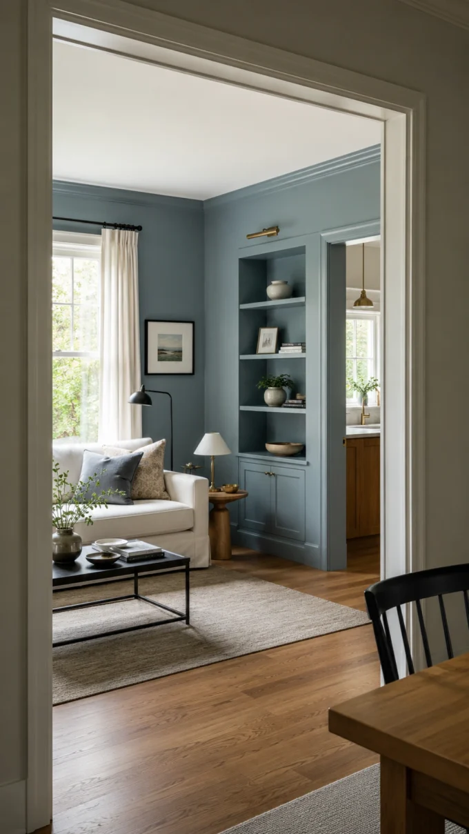
Misty blue gives a living room color without dominating the furniture.
Look for a pale blue with enough gray to soften it. Pair it with warm white walls or trim, natural oak, cream upholstery, and small black or brass details.
This palette works well when the living room needs to feel bright but pure white seems too plain.
Avoid using a very pale blue beside stark blue-white trim unless you want a crisp, icy effect. A warmer white usually makes the blue feel more comfortable.
For help balancing furniture and accessories, see these best home decor tips.
Designer Tip: Test misty blue behind the sofa and on the wall opposite the window. One may look blue while the other appears almost gray.
2. Use Dusty Blue in a Modern Living Room
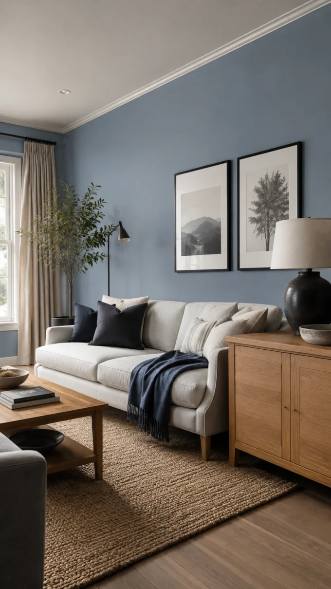
Dusty blue is one of the most flexible cool blue paint ideas for modern living rooms.
Its gray undertone reduces the brightness of blue, allowing it to work almost like a neutral. It pairs naturally with clean-lined furniture, warm timber, textured rugs, black lighting, and off-white fabrics.
Use dusty blue on all walls for a quiet backdrop or on one architectural feature for more contrast.
A modern combination might include:
- Dusty blue walls
- Warm oak furniture
- Cream or tan upholstery
- Matte black frames
- A woven beige rug
- Small rust or clay accents
Do not combine dusty blue with several unrelated gray finishes. Without warmth, the room may feel flat.
3. Make a Small Room Feel Airier With Icy Blue
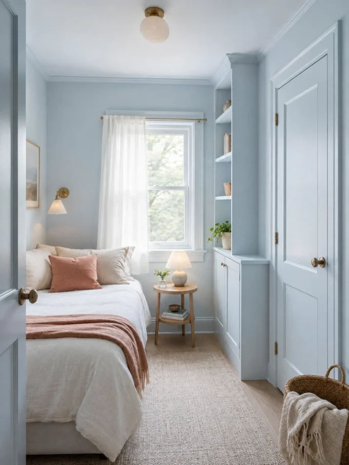
The most successful cool blue paint ideas for small spaces use soft contrast.
Choose an icy blue that remains visible beside the trim but does not create a hard outline around every wall. Painting built-ins or doors in the same family can reduce visual breaks.
Add warmth through:
- Linen curtains
- Light or medium wood
- Cream textiles
- Woven baskets
- Warm-white bulbs
- Tan or muted coral accents
Pale paint cannot physically enlarge a room, but a restrained palette can make its boundaries feel less busy.
Avoid choosing a nearly white blue without sampling it. In a dim room, it may look gray and dull rather than light and refreshing.
4. Create a Serene Bedroom With Blue-Gray
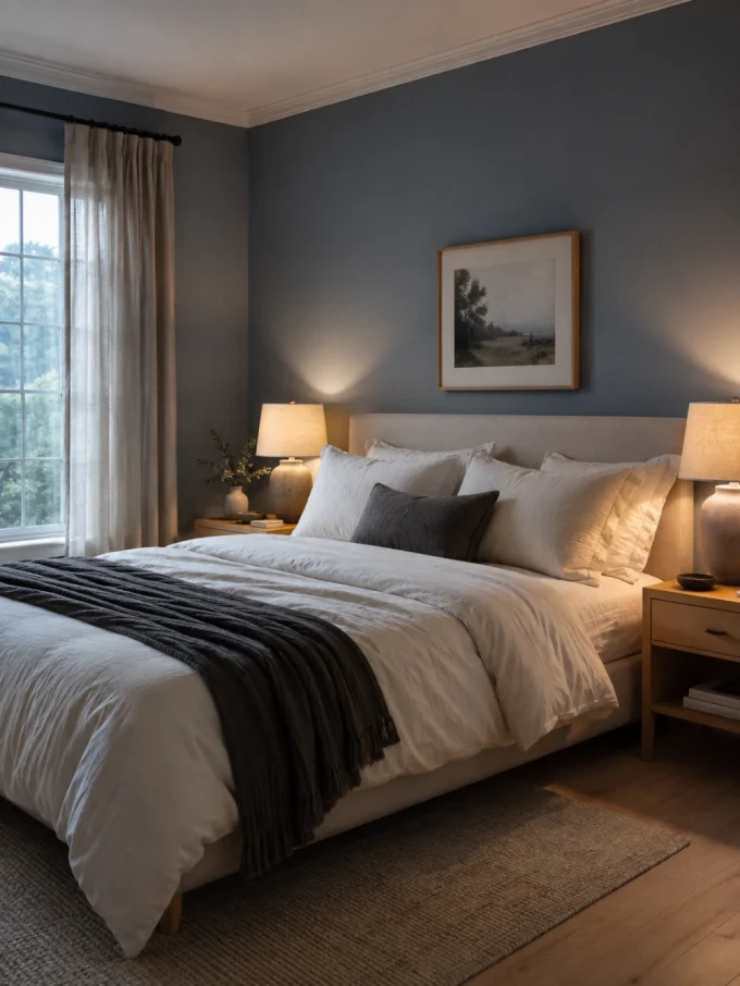
Blue-gray is one of the safest choices for a restful bedroom because it adds color without demanding constant attention.
Use it with warm white bedding, natural linen, pale wood, soft charcoal, and a limited amount of pattern.
For a darker bedroom, choose a blue-gray with enough pigment to remain intentional. Extremely pale shades may lose their blue character in weak daylight.
Test the paint:
- Behind the bed
- Opposite the window
- Beside the curtains
- Next to the flooring
- Under the bedside lamps
The color should still feel comfortable at night, not only during the brightest part of the day.
These contemporary bedroom mirror decor ideas can help you use reflected light without creating glare.
5. Try Blue-Green for a Natural, Restful Mood
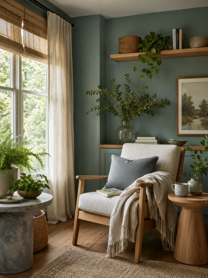
Blue with a restrained green undertone can feel peaceful without appearing overly sweet or decorative.
It works well in bedrooms, bathrooms, reading spaces, sunrooms, and quiet offices. Natural wood, woven materials, stone, and plants strengthen its organic quality.
The main risk is undertone shift. Warm flooring may bring out more green, while cool gray materials can make the color look bluer.
Use a large sample rather than judging the shade from its name. Words such as mist, ocean, rain, and sky do not guarantee how a paint will behave in your room.
6. Paint the Ceiling a Barely-There Blue
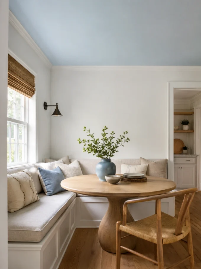
A pale blue ceiling introduces color without covering every wall.
This treatment works especially well in:
- Bedrooms
- Breakfast nooks
- Bathrooms
- Enclosed porches
- Small home offices
- Rooms with simple white walls
Choose a shade lighter than you initially expect. Paint viewed overhead often appears more noticeable than the same sample held vertically.
Repeat the blue in one or two small details, such as artwork, cushions, or a vase. Avoid matching every accessory to the ceiling.
Designer Tip: Paint a large board and hold it overhead before committing. A wall sample does not accurately show how the ceiling will look.
7. Give Kitchen Cabinets a Dusty Blue Finish
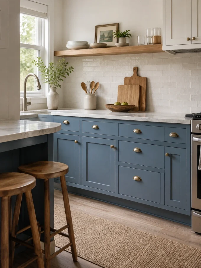
Dusty blue cabinetry can introduce depth without feeling as heavy as black or dark brown.
Medium blue works well on lower cabinets, while lighter cabinets can help a compact kitchen remain open. Deep slate blue is best reserved for rooms with sufficient daylight and simple surrounding finishes.
Pair blue cabinets with:
- Warm white walls
- Pale stone counters
- Simple backsplash tile
- Warm wood stools
- Brushed nickel or aged brass
- Restrained flooring
Choose the cabinet color beside the countertop and floor rather than separately. Their undertones will influence whether the blue looks gray, green, or purple.
For planning storage and circulation, review these open kitchen design ideas.
8. Paint Only the Kitchen Island Blue
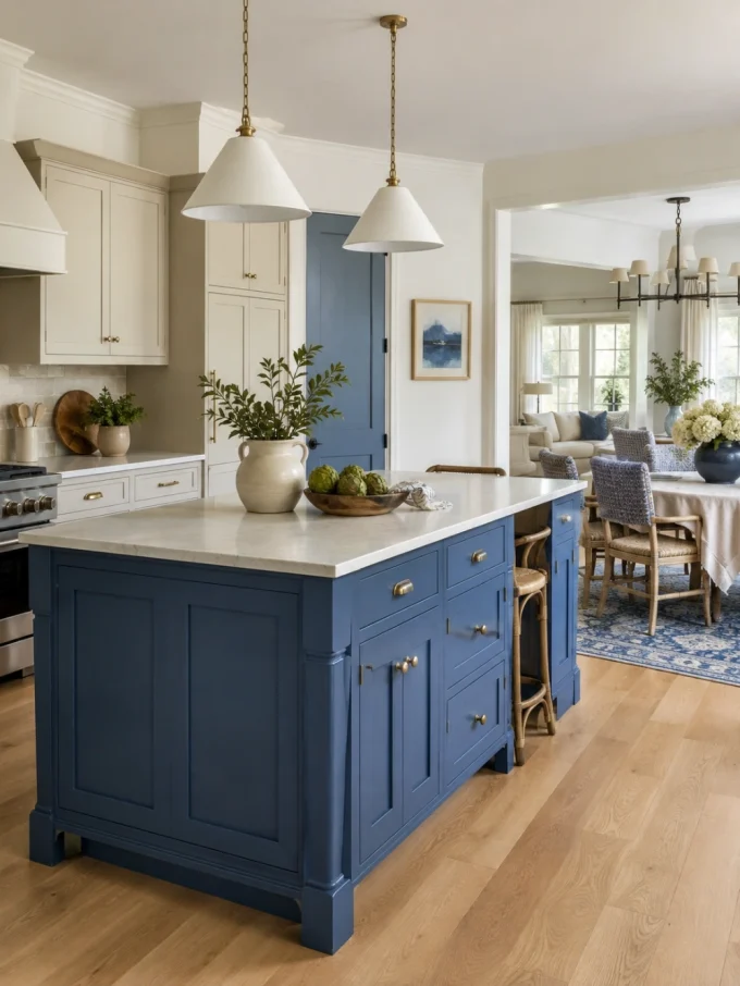
A blue island is a lower-commitment alternative to painting every cabinet.
It creates a focal point while allowing the surrounding cabinetry to remain neutral. This is particularly useful in an open kitchen where a full wall of dark blue could dominate the living area.
Repeat the island color subtly through:
- Dining-chair fabric
- Artwork
- A nearby rug
- Table linens
- Decorative ceramics
- One painted door or cabinet
Do not repeat the exact blue in every object. Small variations in value and texture produce a more natural result.
Remember that very dark island finishes may reveal dust, crumbs, and fingerprints more readily than medium shades.
9. Define a Breakfast Nook With Muted Blue
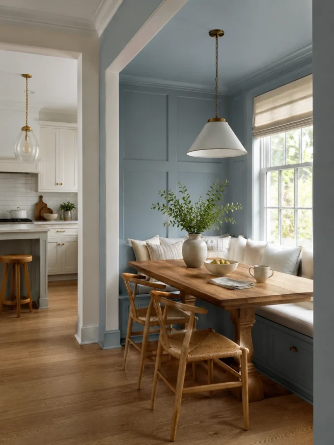
A breakfast nook provides an ideal place to test cool blue paint ideas without repainting the entire kitchen.
Use muted blue on the bench, wall paneling, or one surrounding wall. Then add a wood table, warm white cushions, and a focused pendant.
Pale blue works well in a bright nook, while dusty medium blue can visually separate the dining corner from an open kitchen.
Avoid using identical blue on the walls, curtains, upholstery, and table accessories. Vary the materials so the area feels layered rather than themed.
These best breakfast nook ideas include more seating, table, storage, and lighting options.
10. Give the Bathroom a Fresh Blue Background
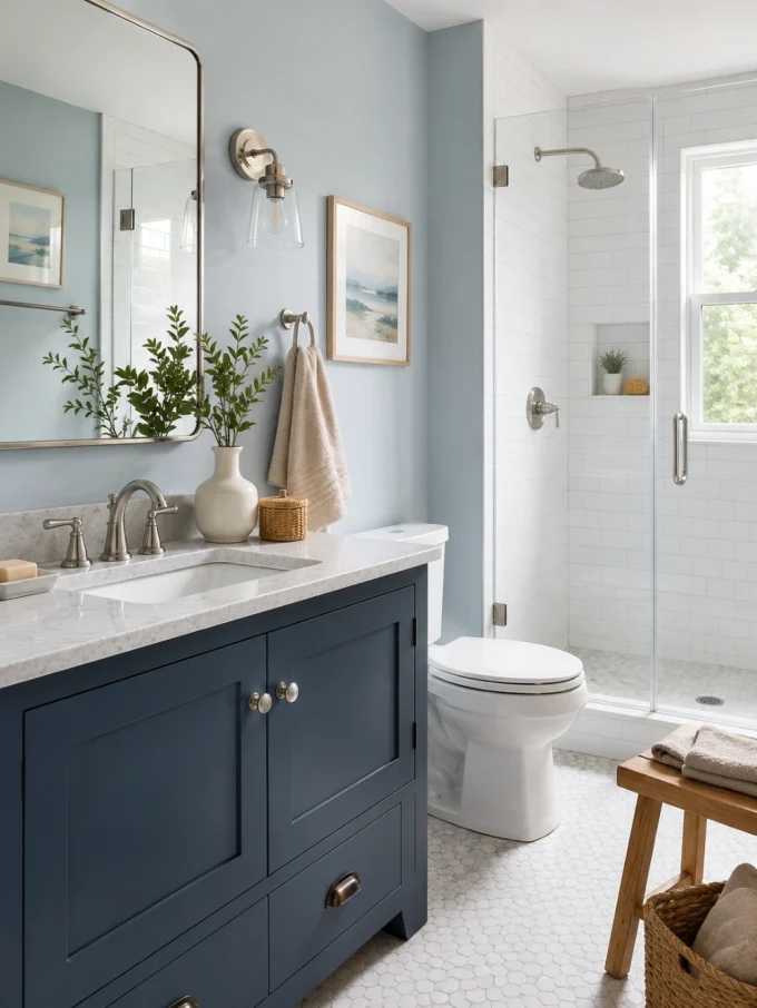
Cool blue naturally complements white fixtures, glass, chrome, and many stone finishes.
Use pale blue-gray on walls outside the main wet zones. For stronger contrast, paint the vanity slate blue while keeping the walls lighter.
Useful combinations include:
- Pale blue with warm white tile
- Dusty blue with oak
- Slate blue with pale stone
- Blue-green with brushed nickel
- Icy blue with soft beige towels
Avoid creating an entirely cold palette. Add wood, woven storage, warm textiles, or greenery to soften the hard surfaces.
These bathroom plant decor ideas can help you add plants without overcrowding the room.
11. Add Deep Slate Blue to an Entryway
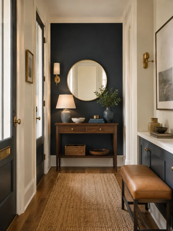
Deep blue can make an overlooked entrance feel deliberate and memorable.
Use it on:
- An interior door
- Lower wall paneling
- A built-in bench
- The console wall
- A narrow cabinet
- One end of a hallway
Keep surrounding surfaces lighter if the entrance receives limited daylight. Warm wood, tan leather, aged brass, and natural-fiber rugs prevent slate blue from feeling severe.
A narrow hallway does not need blue on every wall. One defined surface may create enough impact.
See these stunning hallway ideas for ways to coordinate color with runners, mirrors, and lighting.
12. Use Crisp Blue to Give a Home Office Focus
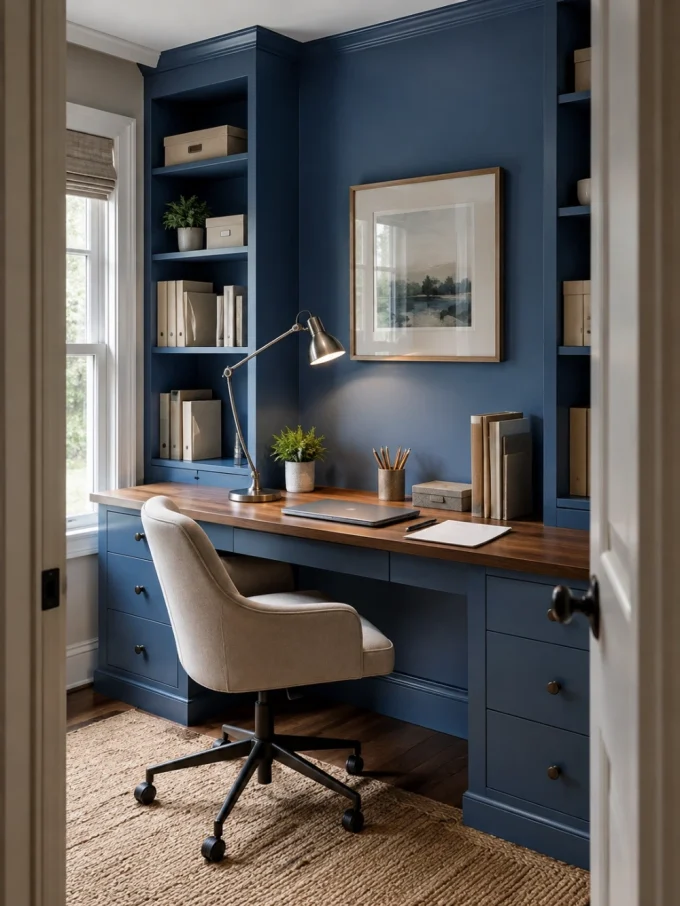
A medium cool blue can make a home office feel defined without becoming distracting.
Use it behind the desk, on built-in shelving, or throughout a small enclosed room. A clearer blue feels more energetic, while a grayer blue creates a quieter setting.
Check the paint under your actual work lighting. Strong blue walls can reflect color onto white paper, furniture, and faces during video calls.
Balance the room with warm wood, neutral storage, and simple task lighting.
For a fuller workspace plan, explore these office interior design ideas.
13. Color-Drench a Small Room
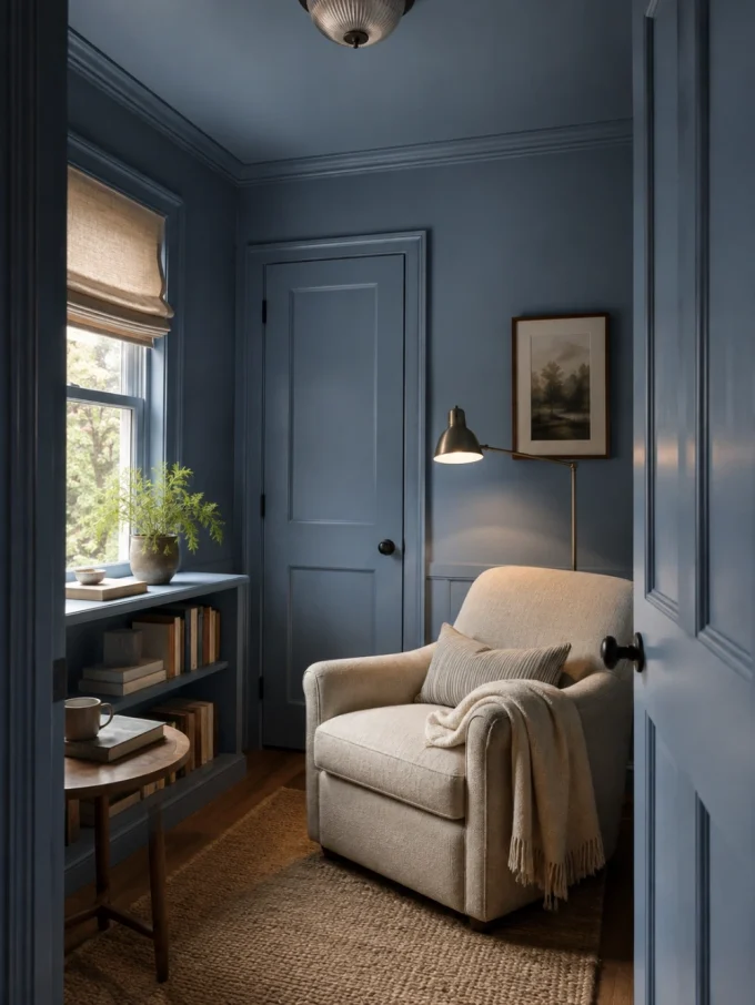
Color drenching uses one blue across the walls, trim, doors, and sometimes the ceiling.
This approach can make a compact room feel more unified because contrasting edges no longer divide every surface.
It works particularly well in:
- Powder rooms
- Small studies
- Reading rooms
- Dressing areas
- Enclosed entries
- Cozy bedrooms
Use different finishes for function. Walls may suit a matte or eggshell finish, while doors and trim usually need a more durable surface.
Choose a softened blue unless the room receives enough light to support a highly saturated color.
14. Combine Blue Paint With Wall Texture
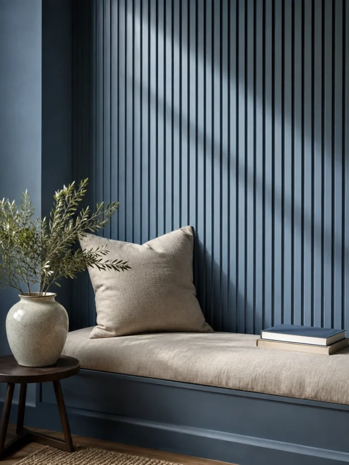
Texture can make blue appear richer because grooves and raised areas create natural shadow.
Try cool blue on:
- Picture-frame molding
- Board and batten
- Fluted panels
- Subtle plaster
- Vertical battens
- Textured wallpaper
- The back of built-in shelving
Deep texture usually needs a quieter color. A highly detailed wall combined with bright blue may become visually overwhelming.
Test the paint directly on the intended material. A medium blue can look noticeably darker inside grooves.
Explore these wall texture design ideas before choosing the finish.
15. Warm Up Blue With Natural Wood
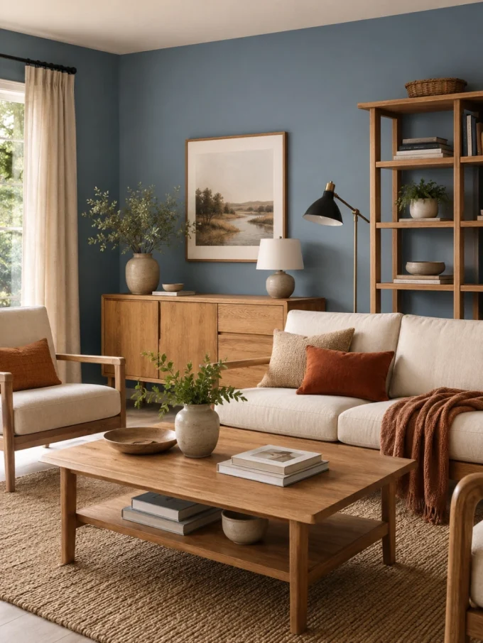
Natural wood is one of the easiest ways to prevent cool blue paint ideas from feeling cold.
Oak, walnut, teak, and medium stained woods introduce warmth while allowing blue to remain clear and fresh.
A balanced living room could combine:
- Dusty blue walls
- Oak furniture
- Cream upholstery
- Tan or rust accents
- A woven rug
- Black or brass lighting
Avoid mixing several strongly orange wood tones without testing them beside the paint. Warm timber can make a green-blue shade appear more teal.
Repeat one main wood tone and use smaller variations sparingly.
16. Pair Blue With Warm White and Black
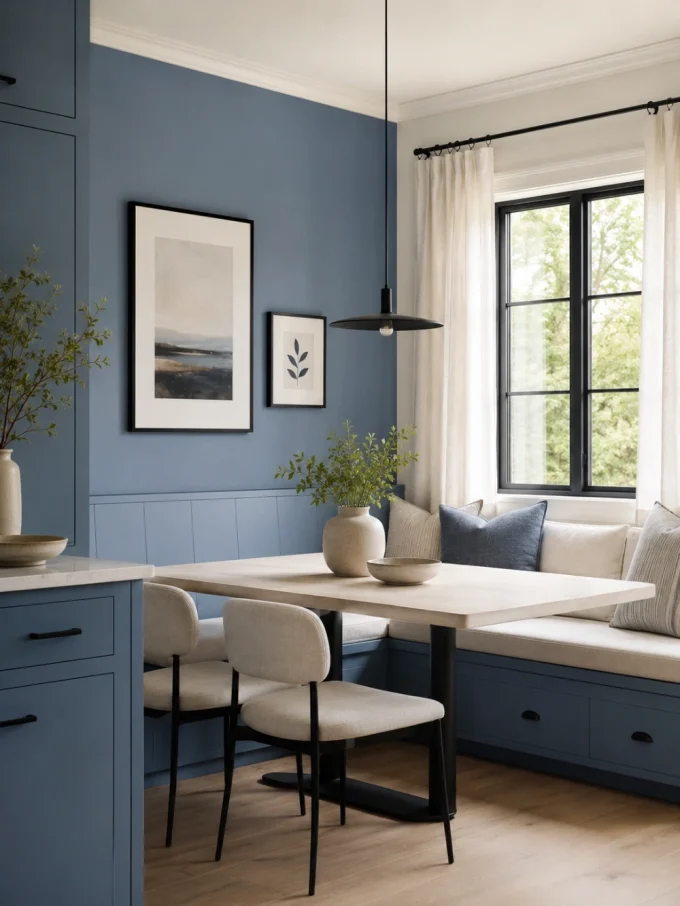
Cool blue, warm white, and black create a simple modern palette.
Use warm white on ceilings and larger neutral surfaces. Add black through thin details such as:
- Picture frames
- Lighting
- Chair legs
- Curtain rods
- Cabinet handles
- Window frames
Let blue remain the main color rather than giving all three equal visual weight.
Too much black can overpower a pale blue room. Keep it controlled and repeat it only enough to make the details feel connected.
These small black and white living room ideas offer more guidance on balancing strong contrast.
17. Select Exterior Blue for Sunlight and Weather
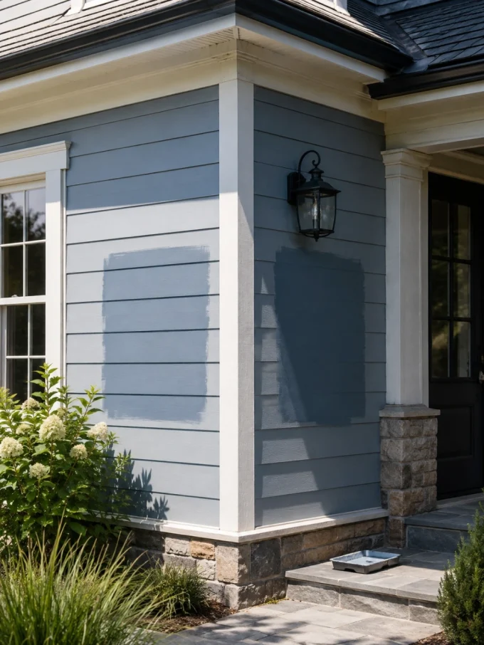
Exterior cool blue paint ideas must be tested outdoors. Direct daylight usually makes paint appear brighter and lighter than it looks indoors.
Apply large samples on more than one side of the building. Compare them with the roof, brick, stone, paving, trim, and nearby landscaping.
Blue and green exterior colors may lose color faster than some earth pigments, and higher-quality exterior acrylic-latex paints generally resist fading better than lower-grade or interior coatings used outside. Surface preparation and using an exterior-rated product also matter.
To reduce the risk of disappointment:
- Test the color in direct and shaded light
- Prepare and prime the surface correctly
- Use paint intended for the exterior material
- Follow the required application conditions
- Keep leftover labeled paint for future touch-ups
Coordinate the finished color with these outdoor wall-mounted light fixture ideas.
18. Introduce Cool Blue in a Rental Home
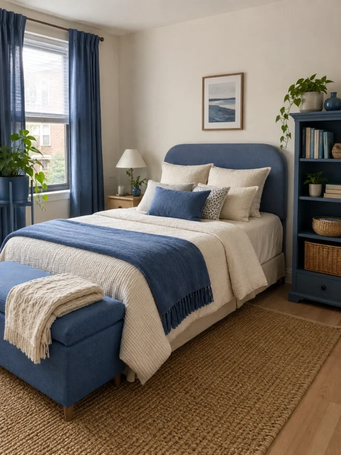
Renters can explore cool blue paint ideas without repainting permanent walls.
Use blue on movable pieces such as:
- A freestanding bookcase
- A small cabinet
- A desk
- A removable headboard
- Picture frames
- A storage bench
- A plant stand
Blue can also appear through curtains, bedding, artwork, rugs, and removable finishes permitted by the lease.
This approach helps you test whether the color works with your furniture before using it more permanently in a future home.
For more reversible changes, see these rental apartment decorating ideas.
How to Choose the Perfect Cool Blue Paint
Choosing blue is easier when you compare a small group of undertones rather than dozens of random shades.
Select:
- One pale icy blue
- One gray-blue
- One blue-green
- One slightly deeper dusty blue
Apply each to a large movable board. Place the boards beside the flooring, trim, curtains, and main furniture.
View them:
- In the morning
- In midday light
- At sunset
- Under evening lamps
- On the brightest wall
- On the darkest wall
Eliminate any shade that turns unpleasantly green, violet, or gray in your most-used lighting.
Do not choose only the sample that looks most attractive at noon. The room must also feel comfortable when you use it most often.
Common Cool Blue Paint Mistakes
Choosing Color From a Screen
Digital images can help identify a color family, but they cannot reliably reproduce the final paint color.
Testing a Tiny Patch
A small square does not reveal how the shade will behave across an entire wall. Use a large board or generous sample area.
Ignoring Fixed Materials
Flooring, stone, cabinets, and upholstery may expose undertones that were not obvious on the color card.
Pairing Icy Blue With Stark White
This can produce a crisp result, but it may also make a room feel clinical. Warm white is often easier to live with.
Assuming Every Blue Is Calming
Bright, saturated blue can feel energetic. A softer gray-blue or blue-green is usually more restful.
Using the Same Blue Everywhere
A color suitable for a sunny kitchen may look dull in a dark hallway. Adjust the depth and undertone for each room.
Forgetting Paint Finish
More reflective finishes can make color feel brighter and highlight surface imperfections. Choose sheen according to the wall condition and cleaning needs.
Budget-Friendly Ways to Use Cool Blue
You do not need to repaint a complete room.
Use leftover or smaller quantities of paint on:
- One interior door
- A vanity
- Built-in shelves
- A kitchen island
- Lower wall paneling
- A thrifted cabinet
- The back of a bookcase
- A small powder room
A limited project allows you to live with the color before making a larger commitment.
Conclusion
The best cool blue paint ideas begin with the room rather than a trend chart.
Use icy blue to soften a compact space, dusty blue to add sophistication to a living room, blue-gray for a restful bedroom, and deeper slate shades for cabinets, doors, and architectural features.
Warm wood, cream textiles, natural texture, and thoughtful lighting keep cool blue comfortable rather than cold. Large physical samples reveal undertones that cannot be judged reliably on a screen.
Once the light, materials, and practical needs are considered, cool blue paint ideas can add calm, freshness, and lasting character without making the home feel overly themed.
What Is the Coolest Blue Color?
There is no single coolest blue because the result depends on its undertones and surroundings. Blues with gray, green, or violet influence generally appear cooler than red-leaning blues. A pale icy blue may feel crisp, while a dark slate blue can feel cooler and more dramatic.
What Are the Best Cool Blue Paint Colors for a Living Room?
Useful starting points include Benjamin Moore Glass Slipper, Palladian Blue, Ocean Air, and Santorini Blue, along with Sherwin-Williams Silvermist, Languid Blue, and Breezy. The best choice depends on the room’s light, flooring, furniture, and desired contrast.
What Cool Blue Paint Works in a Serene Bedroom?
Soft blue-gray, muted sky blue, and gentle blue-green shades usually work better than bright primary blue. Sample colors such as Sleepy Blue, Silvermist, Ocean Air, or Santorini Blue, then compare them with the bedding and evening lighting.
Which Brand Makes the Best Cool Blue Paint?
No single brand is best for every project. Benjamin Moore and Sherwin-Williams both offer extensive blue collections. Compare the exact product line, finish, washability, coverage, exterior suitability, local availability, and price rather than selecting only by brand name.
Where Can I Find Icy Blue Paint Samples?
Official paint-brand websites and authorized retailers offer color chips, peel-and-stick sheets, and wet paint samples. Large movable samples are more useful than small chips because you can test them on several walls and under different lighting.
What Is the Prettiest Shade of Blue?
The prettiest blue is the one that works with the room. Pale blue-gray feels soft and airy, dusty blue looks understated, blue-green feels natural, and deep slate blue creates drama. Judge the shade beside your actual flooring, trim, furniture, and daylight.
How Do I Choose Cool Blue Paint for a Small Space?
Use a softened light or medium blue rather than an extremely bright shade. Keep the contrast with trim relatively low, add warm materials, and test every wall. A darker blue can also work in a small room when used intentionally with good lighting and limited clutter.
How Can I Keep Exterior Blue Paint From Fading Quickly?
Use a high-quality exterior-rated coating, prepare and prime the surface correctly, follow the application conditions, and choose a product designed for color retention. Test the shade in direct sunlight and maintain the exterior rather than waiting for the coating to fail completely.