

Paint is one of the most powerful design decisions a homeowner can make.
Unlike furniture or decor accessories, wall color changes the entire visual foundation of a room. It affects how large a space feels, how warm materials appear, how artwork stands out, and whether a home feels carefully designed or simply decorated.
However, choosing a luxury paint color is often misunderstood.
Many people search for “expensive-looking” colors and expect a single perfect shade to transform their home. In reality, luxury interiors rarely depend on one magical color. They succeed because the paint works with the room around it.
A deep green may look elegant in a room with warm wood and natural light but heavy in a small north-facing space. A beautiful beige may feel sophisticated with stone and linen but dull beside cooler finishes. Even classic white can appear flat when its undertone conflicts with flooring or furniture.
The best luxury paint colors create harmony.
They support the architecture, enhance materials, and establish the emotional atmosphere you want your home to have.
This guide explores 17 luxury paint colors ideas through that practical lens—helping you understand not only what colors look beautiful, but where they work, what they pair with, and when you should choose something else.
For more inspiration on creating refined interiors, explore:
Before Choosing a Luxury Paint Color: Understand What Creates a High-End Look
A luxury interior usually has three qualities:
1. The Color Has Depth
Flat colors often look inexpensive because they lack complexity.
High-end interiors commonly use shades with subtle undertones—such as gray mixed into green, beige mixed into white, or brown mixed into charcoal.
These small variations allow the color to change naturally throughout the day.
2. The Color Works With Existing Materials
A paint color should not compete with:
- Flooring
- Countertops
- Furniture
- Wood tones
- Metal finishes
- Fabrics
For example, warm oak flooring usually works better with creamy neutrals and earthy greens than with icy blue-grays.
3. The Color Matches the Room’s Purpose
A bedroom, dining room, bathroom, and hallway do not require the same emotional atmosphere.
A relaxing bedroom may benefit from muted tones, while an entertaining space can handle deeper dramatic colors.
The goal is not simply choosing a beautiful shade.
The goal is choosing the right shade for the specific situation.
1. Warm Greige: The Foundation of Quiet Luxury
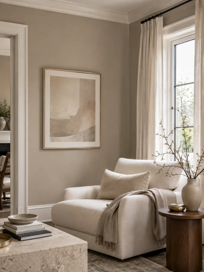
Warm greige remains one of the most dependable luxury paint choices because it balances sophistication and comfort.
Unlike traditional gray, which can sometimes feel cold, greige introduces beige undertones that create a softer and more welcoming appearance.
Why It Works
Luxury interiors often rely on restraint. Greige creates a calm background where architecture, furniture, and artwork become more noticeable.
It works especially well because it bridges different styles:
- Modern
- Transitional
- Minimalist
- Traditional
Best Rooms
- Living rooms
- Open-plan spaces
- Hallways
- Bedrooms
Pair It With
- Natural oak
- Cream upholstery
- Stone surfaces
- Brass lighting
- Black accents
Avoid If
Your room already contains many warm beige elements and you want stronger contrast. In that situation, greige may blend too much rather than create definition.
A warm greige wall can also complement a sophisticated dining area. For more inspiration:
2. Deep Navy Blue: The Boutique Hotel Effect
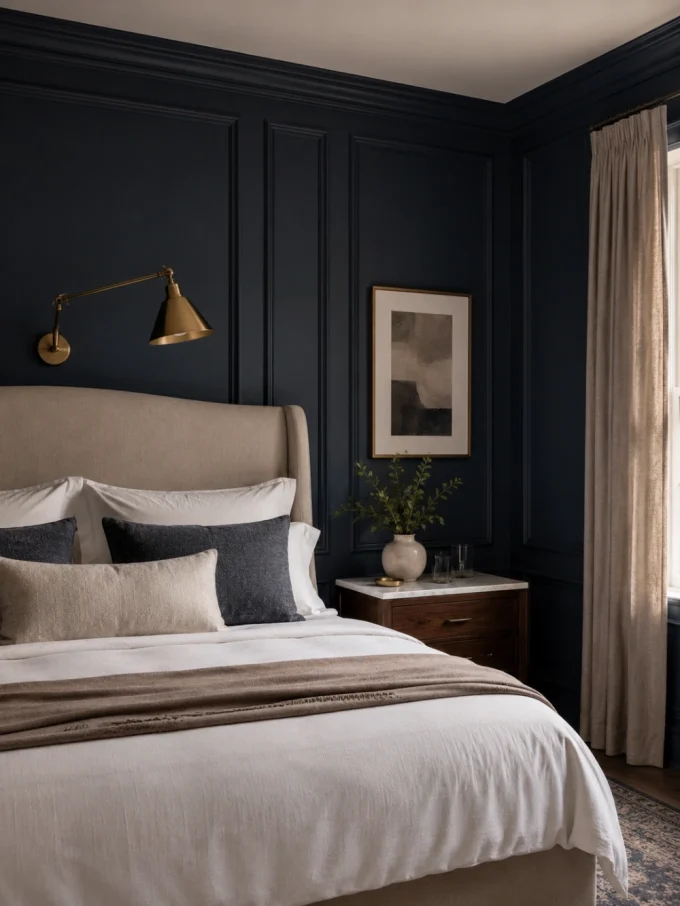
Deep navy creates a sense of confidence and sophistication.
It is one of the few dark colors that can feel both dramatic and timeless.
Why It Works
Navy creates visual depth. It allows lighter materials—such as marble, brass, cream fabrics, and pale woods—to stand out.
The result is often similar to luxury hospitality interiors where contrast creates elegance.
Best Rooms
- Dining rooms
- Bathrooms
- Home offices
- Feature walls
Pair It With
- White trim
- Brass fixtures
- Marble
- Warm lighting
Avoid If
The room has limited lighting and very little reflective surface. A dark navy room may require layered lighting to avoid feeling closed in.
For bathroom applications:
3. Soft Ivory: A More Sophisticated Alternative to White
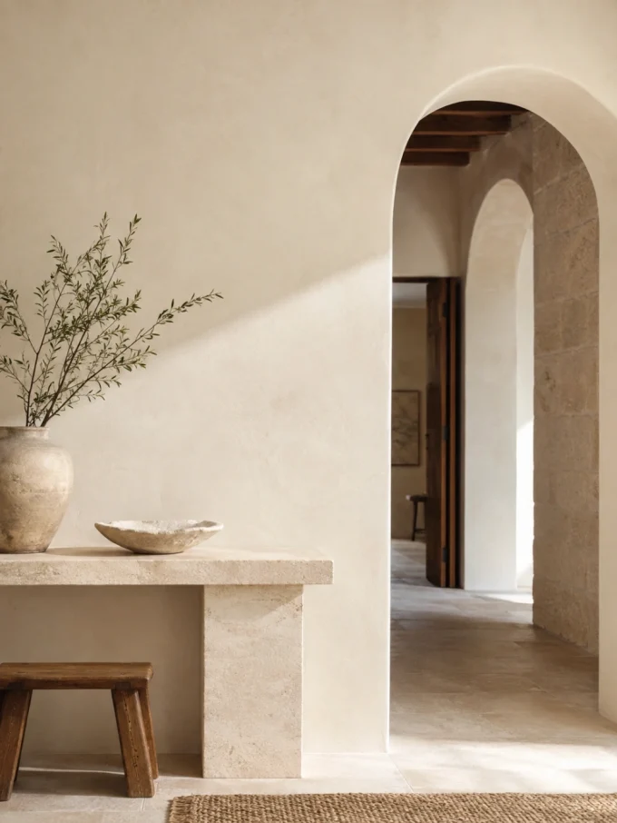
Soft ivory creates the feeling of natural plaster, aged stone, and carefully considered interiors.
It is warmer than pure white while maintaining a clean appearance.
Why It Works
Many luxury homes avoid harsh contrasts and instead create layers of similar tones.
Ivory allows texture to become the focus:
- Linen curtains
- Wood grain
- Artwork
- Handmade ceramics
Best Rooms
- Living rooms
- Bedrooms
- Entryways
- Ceilings
Pair It With
- Walnut furniture
- Antique pieces
- Natural textiles
- Stone finishes
Avoid If
Your home already has strong yellow or warm beige elements. The wrong ivory can make those tones appear stronger.
4. Forest Green: Organic Luxury With Character
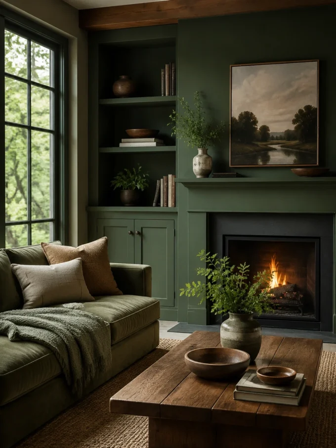
Forest green brings richness while maintaining a connection to nature.
It works especially well in homes where natural materials are already present.
Why It Works
Green sits comfortably beside:
- Wood
- Leather
- Stone
- Plants
It creates a collected, timeless feeling rather than a short-lived trend.
Best Rooms
- Libraries
- Dining rooms
- Bedrooms
- Kitchen cabinets
Pair It With
- Walnut wood
- Aged brass
- Cream fabrics
- Natural stone
For colorful kitchen inspiration:
colourful kitchen cabinet ideas
5. Charcoal Gray: Modern Architectural Luxury
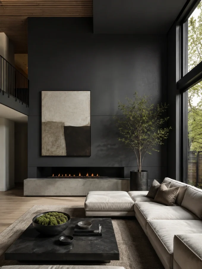
Charcoal gray creates the sophistication of black while remaining softer and more adaptable.
It is especially effective in modern homes where clean lines, strong shapes, and carefully selected materials need a strong background.
Why It Works
Many luxury interiors use darker neutrals because they create contrast. Charcoal allows lighter elements to become visually stronger:
- Artwork appears more dramatic
- Fireplaces become architectural features
- Metallic finishes stand out
- Furniture silhouettes become clearer
Unlike pure black, charcoal maintains enough softness to avoid feeling overly severe.
Best Rooms
- Living rooms
- Media walls
- Fireplaces
- Entryways
- Home offices
A charcoal fireplace wall, for example, can create a stronger focal point without requiring expensive structural changes.
Explore more ideas:
Pair It With
- Warm oak
- Cream upholstery
- Brushed brass
- Natural stone
- Textured fabrics
Avoid If
The room already lacks natural light and has very dark flooring or furniture. Too many dark surfaces can reduce visual balance.
6. Rich Chocolate Brown: Warm, Layered Luxury
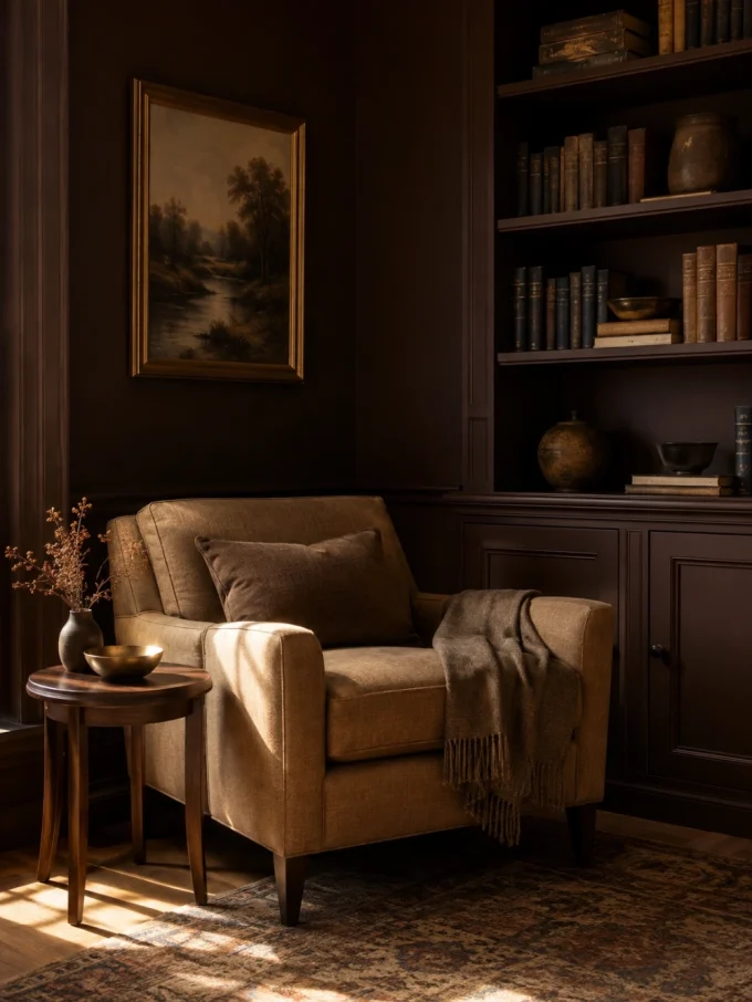
Brown has become increasingly popular in sophisticated interiors because it creates warmth that many gray-based palettes lack.
A deep chocolate shade can make a room feel established, comfortable, and intentional.
Why It Works
Luxury is often associated with natural materials:
- Leather
- Wood
- Stone
- Wool
- Aged metals
Brown connects directly with these materials, allowing the room to feel cohesive.
Best Rooms
- Libraries
- Dining rooms
- Bedrooms
- Formal living rooms
Pair It With
- Ivory fabrics
- Walnut furniture
- Bronze finishes
- Textured rugs
Avoid If
Your room already has many dark wood elements and limited daylight. A lighter earthy shade may create better balance.
7. Dusty Blue: Relaxed Elegance
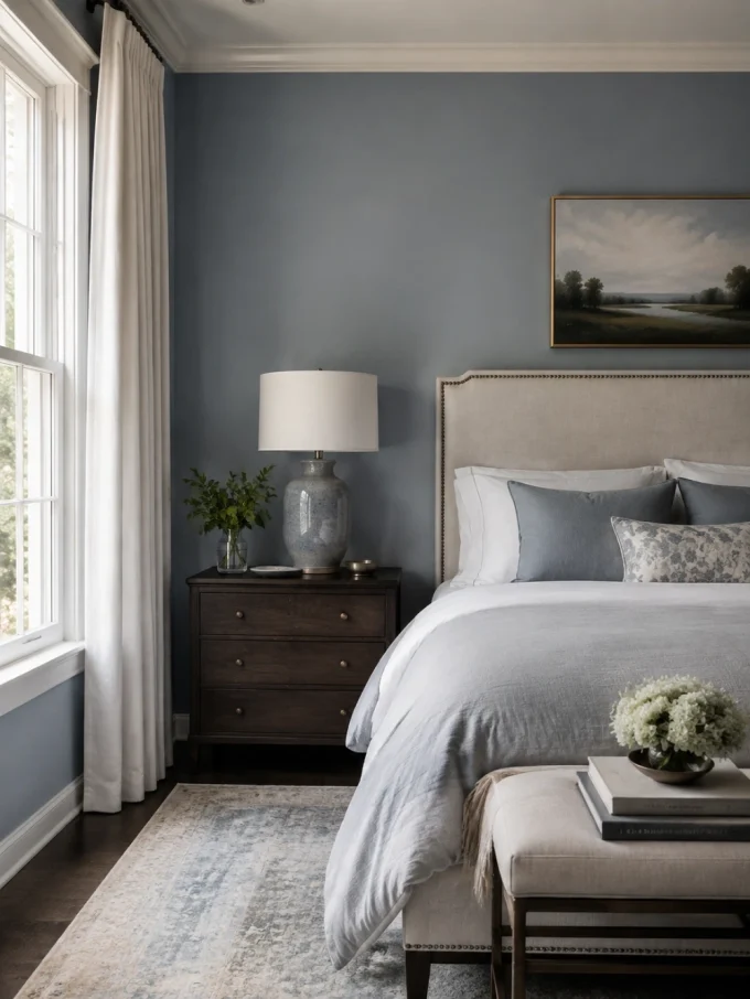
Dusty blue offers a quieter alternative to stronger navy tones.
It creates a refined atmosphere without becoming the dominant feature of the room.
Why It Works
The muted gray undertone gives dusty blue a more mature appearance than brighter blues.
It feels:
- Calm
- Collected
- Timeless
Best Rooms
- Bedrooms
- Bathrooms
- Reading spaces
- Guest rooms
Pair It With
- White trim
- Pale wood
- Linen textiles
- Brushed metals
For more blue-based inspiration:
Avoid If
Your home has very cool lighting and gray finishes everywhere. The room may begin feeling too cold without warmer materials.
8. Olive Green: Understated Designer Character
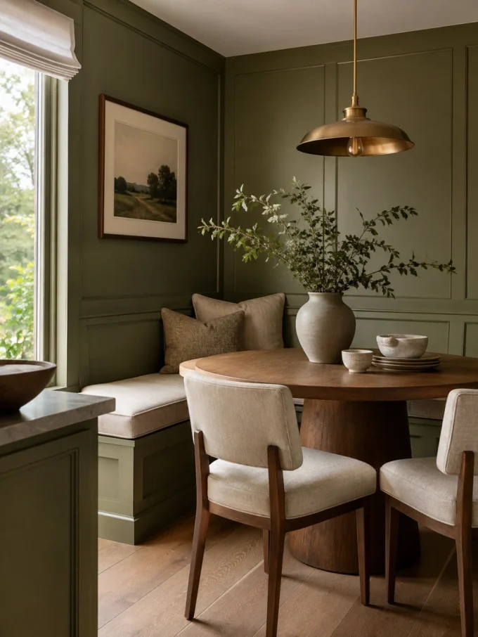
Olive green sits between natural and sophisticated.
It is less dramatic than forest green but creates more personality than traditional neutrals.
Why It Works
Olive has a historic quality that makes spaces feel collected rather than newly decorated.
It works particularly well when you want a home to feel:
- Timeless
- Comfortable
- Artistic
Best Rooms
- Kitchens
- Dining rooms
- Entryways
- Bedrooms
Pair It With
- Natural wood
- Ceramic textures
- Aged brass
- Warm whites
Olive is also effective in homes inspired by earthy autumn palettes:
9. Black: Dramatic Luxury When Used Strategically
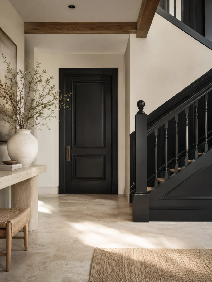
Black paint creates one of the strongest visual statements available.
However, luxury black interiors depend on restraint.
The goal is not to make everything dark. The goal is to create contrast.
Why It Works
Black can highlight:
- Architectural details
- Shelving
- Fireplaces
- Doors
- Cabinetry
A black accent wall can make surrounding lighter elements appear more intentional.
Best Rooms
- Dining rooms
- Powder rooms
- Offices
- Feature walls
Pair It With
- Warm lighting
- Natural wood
- Artwork
- Metallic details
Avoid If
You are using black simply to hide design problems. Dark paint enhances a room’s character, but it does not fix poor proportions or insufficient lighting.
10. Terracotta: Earthy Mediterranean Luxury
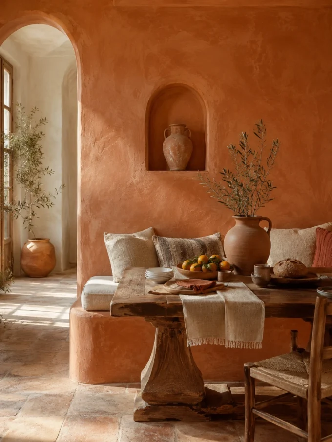
Terracotta adds warmth, personality, and a connection to handmade materials.
It creates a different type of luxury—less formal, more organic.
Why It Works
Modern luxury interiors increasingly value:
- Authenticity
- Texture
- Natural materials
Terracotta supports this approach by creating warmth without relying on bright colors.
Best Rooms
- Dining rooms
- Kitchens
- Bedrooms
- Cozy living spaces
Pair It With
- Cream
- Rattan
- Wood
- Natural stone
- Woven textiles
Avoid If
Your room already has many orange or warm-red elements. The color may become overpowering.
11. Soft Taupe: The Designer Neutral
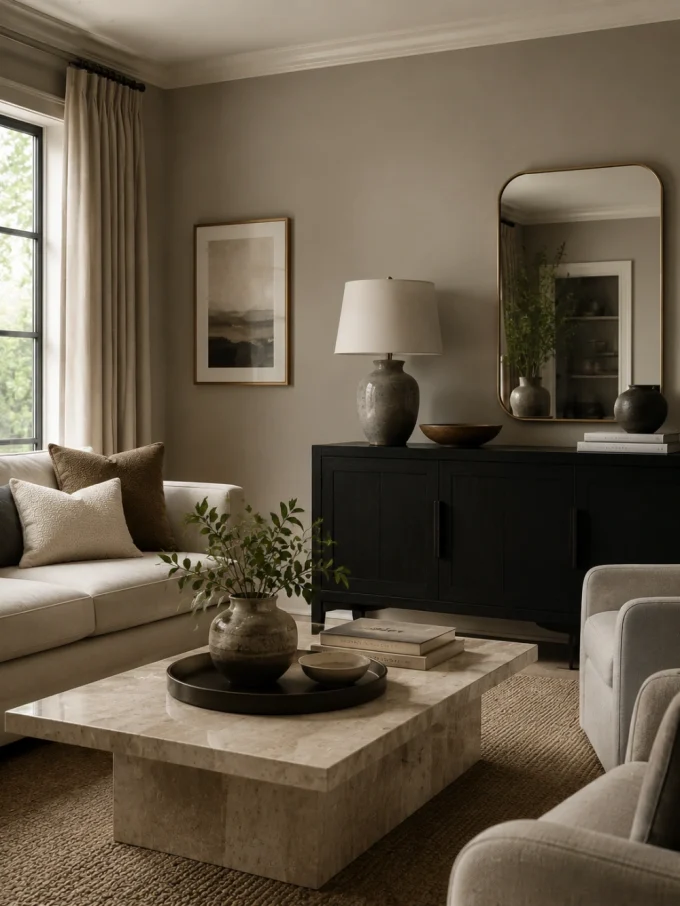
Taupe is one of the most flexible luxury neutrals because it balances warmth and sophistication.
It avoids the flat appearance of basic beige while remaining easy to decorate around.
Why It Works
Taupe creates a quiet background that allows:
- Furniture texture
- Artwork
- Lighting
- Architectural details
to become more noticeable.
Best Rooms
- Bedrooms
- Living rooms
- Hallways
- Dressing areas
For more refined hallway inspiration:
chic narrow hallway decor ideas
Pair It With
- Marble
- Velvet
- Black accents
- Warm metals
Avoid If
Your home already lacks contrast. Add darker furniture or stronger textures so the room does not feel visually flat.
12. Plum Purple: Moody Boutique Luxury
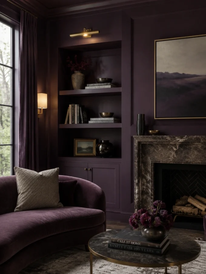
Purple is often avoided because people associate it with overly dramatic interiors.
The right plum shade, however, creates sophistication and depth.
Why It Works
Deep plum contains enough red warmth to feel inviting while maintaining the richness associated with jewel tones.
Best Rooms
- Bedrooms
- Reading corners
- Dining rooms
- Creative spaces
Pair It With
- Cream
- Walnut
- Brass
- Velvet textures
More purple inspiration:
Avoid If
The room is already crowded with strong colors. Plum works best when surrounding elements are controlled.
13. Sage Green: Soft Natural Luxury
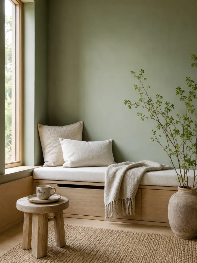
Sage green creates a peaceful atmosphere and works particularly well in homes inspired by natural minimalism.
Why It Works
Its muted quality allows it to blend with:
- Wood
- Stone
- Plants
- Natural fabrics
It creates warmth without requiring a strong statement color.
Best Rooms
- Bedrooms
- Bathrooms
- Kitchens
- Meditation spaces
For calm bedroom inspiration:
Pair It With
- Oak
- Linen
- Ceramic finishes
- Warm white
14. Warm White: The Luxury Gallery Effect
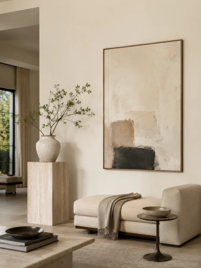
Warm white is not simply a safer version of white.
The correct warm white creates a refined backdrop similar to high-end galleries and carefully designed homes.
Why It Works
It allows:
- Artwork to stand out
- Textures to become visible
- Architectural details to breathe
Best Rooms
- Minimalist interiors
- Entryways
- Living rooms
- Ceilings
Pair It With
- Natural wood
- Stone
- Black accents
- Soft textiles
Avoid If
Your home already contains very yellow lighting or warm finishes. A balanced neutral white may work better.
15. Burgundy: Traditional Luxury With Personality
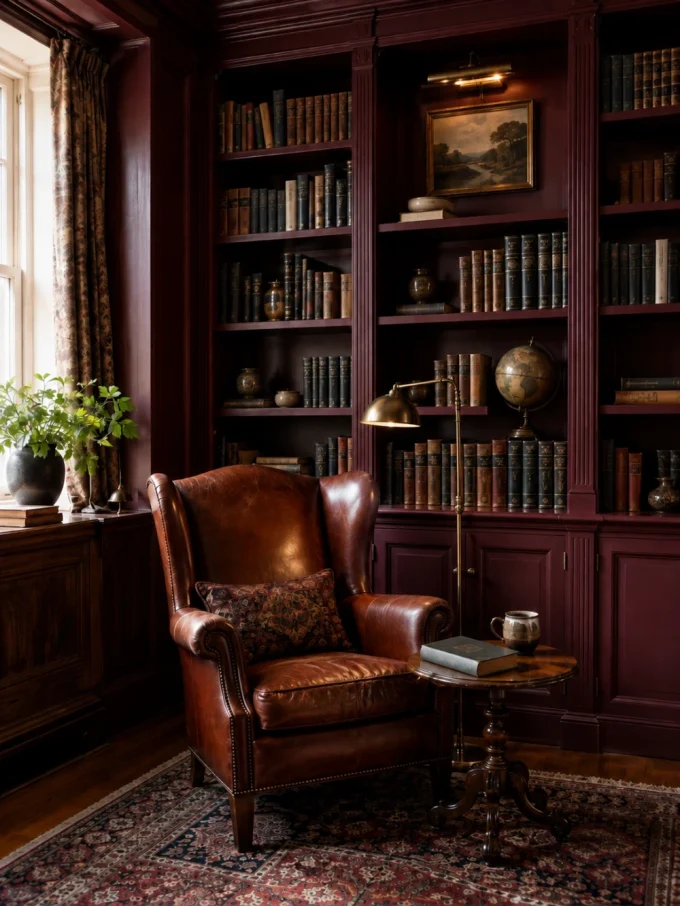
Burgundy creates a rich, dramatic atmosphere.
It is especially suitable for homeowners who want interiors with a classic, library-inspired feeling.
Why It Works
Deep red tones create visual warmth and make spaces feel more intimate.
Best Rooms
- Dining rooms
- Studies
- Formal sitting rooms
Pair It With
- Dark wood
- Antique finishes
- Cream upholstery
Avoid If
The room is small and receives limited natural light unless you balance it carefully with lighter elements.
16. Slate Blue: Modern Sophistication
Slate blue combines the calm qualities of blue with the neutrality of gray.
It is an excellent choice for homeowners who want color without overwhelming the room.
Why It Works
Slate blue adapts well because it feels neither too traditional nor too trendy.
Best Rooms
- Bathrooms
- Bedrooms
- Offices
- Hallways
Pair It With
- Brushed nickel
- White stone
- Warm wood
17. Deep Beige: The New Luxury Neutral
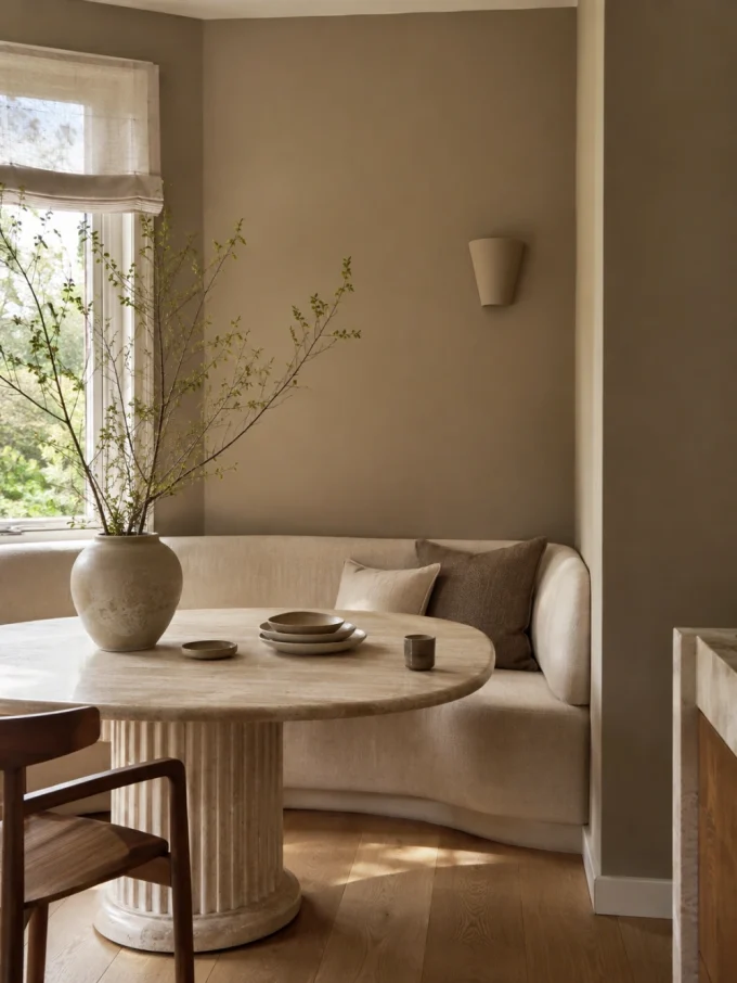
Modern luxury beige is very different from outdated builder beige.
The updated versions contain subtle undertones that create warmth and depth.
Why It Works
Deep beige provides flexibility while still feeling intentional.
It works particularly well when you want a home that feels:
- Calm
- Timeless
- Comfortable
Best Rooms
- Whole-home palettes
- Living rooms
- Bedrooms
- Open spaces
Pair It With
- Natural stone
- Oak
- Linen
- Woven textures
Avoid If
You want a dramatic, high-contrast interior. Beige is designed for refinement rather than visual intensity.
How to Choose Between Luxury Paint Colors
Choosing a luxury paint color becomes easier when you stop asking:
“Which color looks expensive?”
and instead ask:
“Which color solves my room’s design problem?”
Consider these factors:
Light Direction
North-facing rooms often benefit from warmer colors because cooler daylight can make shades appear colder.
South-facing rooms usually handle deeper or cooler tones better because they receive stronger natural light.
Existing Materials
Always compare paint samples beside:
- Flooring
- Countertops
- Cabinets
- Furniture fabrics
A color that looks beautiful alone may clash with the permanent elements of your home.
Room Size
Dark colors do not automatically make small rooms feel smaller. They can create intimacy when the lighting and furniture are balanced.
However, using dark paint everywhere without contrast can reduce flexibility.
Luxury Paint Color Mistakes to Avoid
Choosing a luxury paint color is not only about finding a shade that looks beautiful in a photograph. Many disappointing results happen because homeowners choose colors without considering how the paint will interact with their actual home.
A sophisticated color can become unsuccessful when the surrounding conditions are ignored.
1. Choosing a Color Without Checking Undertones
One of the most common paint mistakes is selecting a color based only on the main shade.
A beige may contain pink, yellow, gray, or green undertones. A gray may lean blue, purple, or warm. A white may appear crisp or creamy depending on what surrounds it.
These subtle differences determine whether a room feels coordinated or mismatched.
Better Approach
Place paint samples beside:
- Flooring
- Furniture
- Countertops
- Curtains
- Existing trim
The goal is not to find the prettiest sample card.
The goal is to find the shade that belongs in your room.
2. Copying a Luxury Color Without Considering Lighting
A paint color does not exist independently from light.
The same shade can appear completely different depending on:
- Window direction
- Time of day
- Artificial lighting temperature
- Nearby reflective surfaces
For example:
A deep green may appear elegant in a bright south-facing room but much darker in a room with limited daylight.
A warm neutral may feel sophisticated in natural light but too yellow under warm bulbs.
Better Approach
Test samples during:
- Morning light
- Afternoon light
- Evening lighting
A small sample board is more reliable than judging a color from a screen.
3. Using Too Many Statement Colors
Luxury interiors usually feel intentional because they have a visual hierarchy.
If every room has a dramatic wall color, the home can lose flow.
A better strategy is:
- Choose one or two stronger colors
- Support them with quieter neutrals
- Repeat tones through furniture and accessories
For example:
A navy dining room can connect beautifully with warm greige hallways and ivory bedrooms.
The colors feel related without being identical.
4. Ignoring Permanent Features
Paint is easier to change than many home elements.
Before choosing a luxury shade, consider permanent features:
- Flooring
- Cabinetry
- Fireplaces
- Countertops
- Architectural details
A paint color should enhance these elements rather than compete with them.
This is especially important in kitchens and bathrooms where materials are expensive and difficult to replace.
Explore kitchen inspiration:
5. Choosing Trends Over Long-Term Fit
A fashionable color can look appealing because it appears frequently online.
However, luxury design usually values longevity.
Ask:
- Will this color still suit my furniture in five years?
- Does it work with the architecture of my home?
- Does it create the mood I actually want?
A timeless shade chosen correctly often creates a more expensive feeling than a trendy shade used without planning.
6. Forgetting About Ceiling and Trim Relationships
Walls are not viewed alone.
Ceilings, doors, trim, and molding affect how a paint color feels.
Examples:
- Warm walls may need warmer white trim.
- Dark walls can become more elegant with carefully chosen contrast.
- Same-color walls and trim can create a modern, seamless appearance.
For more architectural inspiration:
How to Test a Luxury Paint Color Before Committing
Before painting an entire room, use a testing process.
Step 1: Create a Real Sample
Paint a large board instead of relying on a small color chip.
A larger surface reveals:
- Undertones
- Depth
- Contrast
- Texture interaction
Step 2: Move the Sample Around the Room
Place it near:
- Windows
- Furniture
- Flooring
- Lighting sources
A wall color can look different depending on its location.
Step 3: Observe Different Times of Day
Morning
Does the color feel too cool or too bright?
Afternoon
Does natural light improve the shade?
Evening
Does artificial lighting make it warmer or darker?
Step 4: Test Adjacent Rooms
Open layouts require extra consideration.
A color that looks excellent in one room may create an awkward transition into another.
Consider how the paint connects with:
- Hallways
- Kitchens
- Living spaces
For smaller transitions and connected areas:
Luxury Paint Colors by Room
Living Room
The living room usually benefits from colors that create comfort while supporting furniture and artwork.
Strong options:
- Warm greige
- Charcoal
- Deep beige
- Forest green
These shades work well with layered lighting and textured materials.
Related inspiration:
Bedroom
Bedrooms benefit from colors that create calm and depth.
Recommended:
- Dusty blue
- Sage green
- Soft taupe
- Warm ivory
- Muted plum
Avoid overly bright colors that compete with relaxation.
For feature wall inspiration:
Unique bedroom feature wall ideas
Kitchen
Kitchen paint choices need to work with cabinetry, counters, and natural materials.
Luxury options:
- Olive green
- Deep navy
- Warm white
- Soft greige
These colors create sophistication without overwhelming functional areas.
Bathroom
Bathrooms can handle stronger colors because smaller spaces often benefit from visual impact.
Luxury options:
- Navy
- Slate blue
- Charcoal
- Deep green
Combine with:
- Stone textures
- Warm lighting
- Quality fixtures
Related inspiration:
Hallway and Entryway
Hallways are often overlooked, but paint can make them feel intentional.
Good choices:
- Warm neutrals
- Deep charcoal
- Olive
- Soft beige
Entry spaces benefit from colors that create a strong first impression.
Explore:
15 stunning entryway console table ideas that fit any home
Creating a Whole-Home Luxury Color Palette
A luxury home usually feels connected because colors repeat subtly.
A simple approach:
Choose a Base Neutral
Examples:
- Warm greige
- Ivory
- Taupe
Use it for larger areas.
Add One Deep Accent
Examples:
- Navy
- Forest green
- Charcoal
Use for rooms where you want more personality.
Add Natural Supporting Tones
Examples:
- Wood
- Stone
- Linen
- Clay
These materials soften stronger colors.
Final Thoughts: The Most Luxurious Paint Color Is the One That Fits Your Home
The best luxury paint colors are not necessarily the darkest, trendiest, or most dramatic.
They are the colors that respond to your home’s unique conditions.
A successful choice considers:
- Natural light
- Architecture
- Existing materials
- Room purpose
- Long-term style
Warm greige may create quiet sophistication in one home, while deep navy or forest green may create the perfect atmosphere in another.
The goal is not to copy a designer room.
The goal is to understand why the color works and apply that thinking to your own space.
A carefully chosen paint color can become one of the most affordable ways to create a home that feels intentional, timeless, and refined.
Related DecoralCove Inspiration
Continue exploring elevated home design ideas:
- Wall texture design ideas
- Unusual wainscoting ideas
- Home decor items
- Wall sconce light fixtures ideas
- Indoor wall mounted light fixture ideas
FAQ
What Paint Colors Make a House Look Luxurious?
Luxury-looking homes often use colors with depth and balanced undertones, such as warm greige, deep navy, forest green, charcoal, ivory, and rich taupe.
Are Dark Paint Colors Expensive-Looking?
Yes, when used correctly. Dark colors create depth and contrast, especially when paired with good lighting and lighter materials.
What Is the Most Timeless Luxury Paint Color?
Warm neutrals such as greige, ivory, and taupe remain highly adaptable because they work with many furniture styles and materials.
Should Luxury Homes Use Neutral Colors Only?
No. Many sophisticated homes combine neutral foundations with carefully selected deeper shades like navy, green, charcoal, or plum.
How Do I Know if a Paint Color Will Work in My Room?
Test large samples in different lighting conditions and compare them with existing materials before making a final decision.